

Infographics
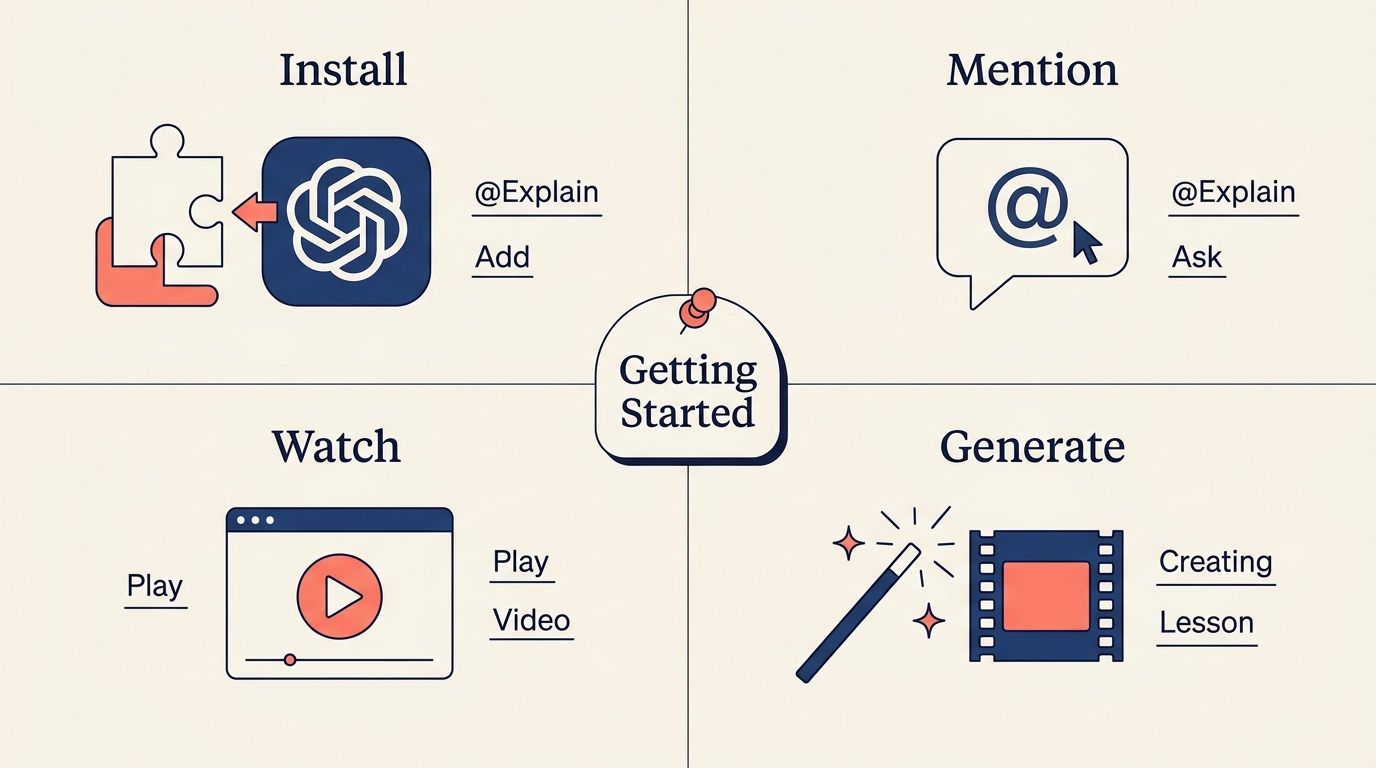
Some topics come in four parts that make more sense together than one after another: the stages of a process, the sides of one idea, the members of a family. Those get an infographic: one picture drawn for your question, split into four labelled parts around a title in the middle.
The picture is explored rather than just shown. The slide opens on the whole thing while the narration sets up the topic, then moves into each part as the voice reaches it, and pulls back out at the end to tie the four together. You get the overview, then the detail, then the overview again.
Unlike an image, which sets a scene, an infographic carries its own headings and short labels drawn into the picture. Those are written in the language you asked in.
Infographics are never used for exact content. Code, syntax, tables, API names, and precise data go on slides that render them precisely, like code and diagrams.
Getting good infographic slides
An explainer reaches for one on its own when a topic breaks cleanly into four parts. Explainers written by a coding agent are asked to include one too. You can also ask: show the four stages as one infographic or compare the four approaches in a single picture.
One infographic is usually enough for a lesson. A second one earns its place when there is a genuinely different four-part angle to cover, rather than the same four parts drawn again.