
Skip to content

Tables

docs.scrimba.com

Some information is a grid. A train timetable, a pricing plan, a league table, a set of nutrition facts: each one has rows and columns, and the meaning lives in how they line up. HTML has a dedicated set of elements for exactly this kind of content, and using them keeps the grid readable both on screen and to software that reads the page aloud.

Table basics

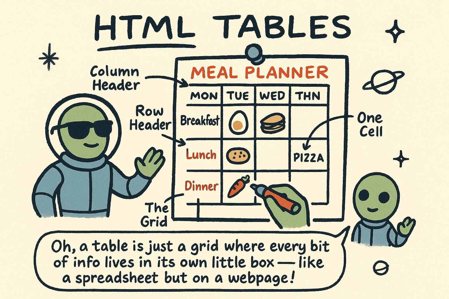
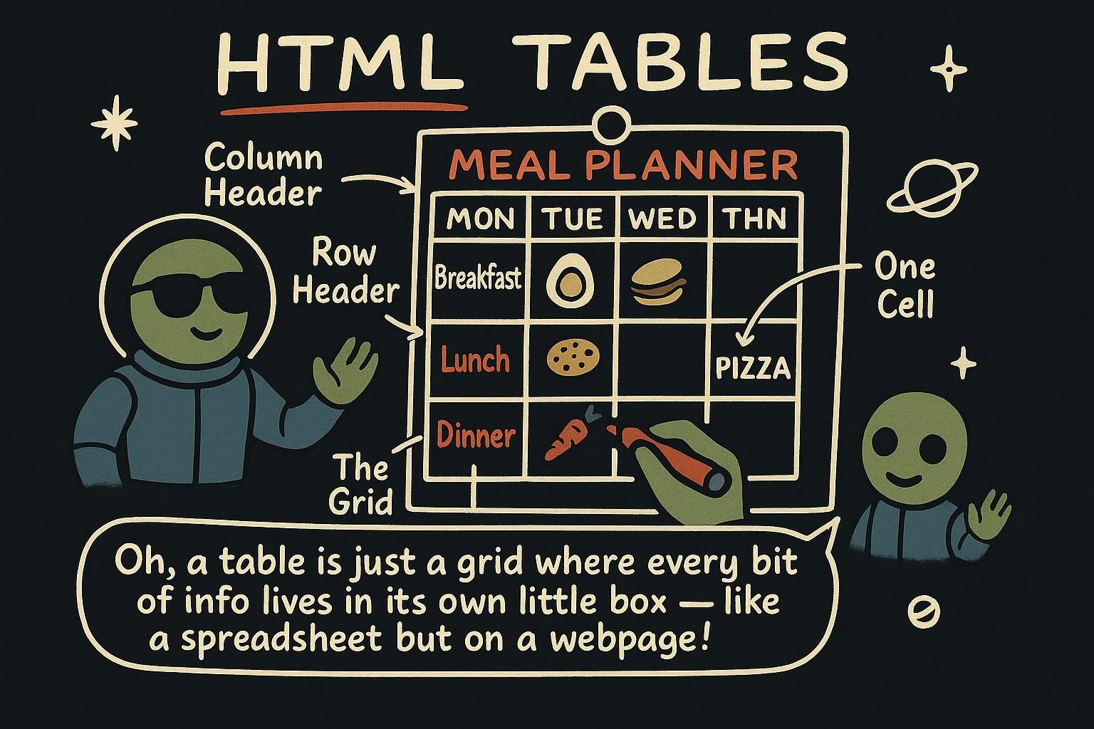
A table is a grid of rows and columns, the same shape as a spreadsheet. You build one from four elements. <table> wraps the whole grid. Each <tr> is one row (tr is short for table row). Inside a row, each <td> is one cell of data (td is table data). When a cell labels its column or row, you use <th> instead (th is table header), and the browser shows it bold and centred so it stands apart from the data.

You build a table row by row, never column by column. <table> is the container, each <tr> is a row, and the cells sit inside the row in the order they appear across the page. A data cell is <td>; a header cell is <th>. There is no column element. Columns are an emergent effect of every row keeping its cells in the same order, so if one row falls out of step the grid stops lining up.

The difference between <th> and <td> is not cosmetic. <th> marks a cell as a heading for the row or column it sits in. The browser's default styling, bold and centred, is only the visible half of that. The other half is meaning that other software can read.

A table's source is row-major: you write it one row at a time, and each cell's column is decided purely by its position within the row. The browser reads that row-by-row source and builds a two-dimensional grid from it, matching cells into columns by counting across. Nothing in the markup names a column, so the grid is only as aligned as your rows are consistent.

<th> versus <td> is a semantic distinction, not a styling one. <th> (a header cell) tells the browser, and any assistive technology reading the page (software such as a screen reader, which speaks the page aloud for people who cannot see it), that this cell is a label for the data around it. The default bold-and-centred look is incidental: strip it away with CSS and the header still means "heading", because the meaning lives in the element, not its appearance. That is the whole reason to reach for a real table instead of drawing a grid some other way.

html
<table>
  <tr>
    <th>Day</th>
    <th>Opening hours</th>
  </tr>
  <tr>
    <td>Monday</td>
    <td>8:00 to 18:00</td>
  </tr>
  <tr>
    <td>Saturday</td>
    <td>9:00 to 14:00</td>
  </tr>
</table>

Two heading cells across the top, then two data rows. The browser draws the grid, sizes each column to fit its content, and renders the two <th> cells bold.

JunoTable basics Four elements make a grid: <table> around the whole thing, <tr> for each row, <td> for a cell, and <th> for a heading cell. The heading cells come out bold and centred so they stand apart from the data. Build it one row at a time and the columns line themselves up.
JunoTable basics You lay a table out row by row with <tr>, and the columns fall out of every row keeping its cells in the same order. <th> for headings, <td> for data, and that choice is meaning, not only the bold look. Miscount the cells in one row and the whole grid goes crooked.
JunoTable basics The markup is row-major, so a column only exists because each row keeps its cells in step. Count carefully. <th> earns its place by telling a screen reader the cell is a label, which is something no amount of CSS bolding can do. That semantic split is the reason to use a real table at all.

Structuring a table

The order of your rows is the order people read them, so put the heading row, the one built from <th> cells, at the top. Then keep every row the same length: if the heading row has three cells, every <tr> below it needs three <td> cells too. A row with a missing cell leaves a gap in the grid and the columns stop lining up. There is nothing new to learn here, only care with the rows you already know.

Once a table grows, group its rows into row groups so the structure is explicit. Wrap the heading row in <thead>, the data rows in <tbody>, and any summary row such as a totals line in <tfoot>. These groups do not change the layout much on their own, but they label the parts of the table for styling, for printing, and for assistive software.

Give the table a title with <caption>, placed as the first child of <table>. It renders above the grid and, unlike a heading you put next to the table, it is tied to the table in the markup.

When a cell needs to cover more than one column or row, use colspan or rowspan. colspan="2" makes a cell as wide as two columns; rowspan="2" makes it as tall as two rows. The positions it covers are then left out of those rows, because that space is already taken:

html
<thead>
  <tr>
    <th rowspan="2">Region</th>
    <th colspan="2">2024</th>
  </tr>
  <tr>
    <th>Q1</th>
    <th>Q2</th>
  </tr>
</thead>

"Region" fills two header rows, "2024" fills two columns, and Q1 and Q2 sit beneath it in the second row.

The row groups are not decoration. <thead> and <tfoot> are defined to repeat on every page when a long table is printed, so a header stays visible across a page break, and they let you keep a fixed header or footer while <tbody> scrolls. A table may hold several <tbody> groups, which is a clean way to split a long dataset into labelled sections without breaking the single grid.

colspan and rowspan control cell spanning (one cell covering more than one column or row), and this is where tables most often break silently. Every row must still account for the full width of the grid. A cell with colspan="2" fills two columns, so the rows it overlaps must leave those positions empty rather than supplying their own cell. Miscount, and the browser will still render something, but not the grid you meant. <caption> is the accessible name for the table: assistive software (tools such as screen readers that read the page aloud) announces it when the reader reaches the table, doing the job a nearby heading cannot.

html
<table>
  <caption>Quarterly revenue by region</caption>
  <thead>
    <tr>
      <th>Region</th>
      <th>Q1</th>
      <th>Q2</th>
    </tr>
  </thead>
  <tbody>
    <tr>
      <th>North</th>
      <td>£12,000</td>
      <td>£15,400</td>
    </tr>
    <tr>
      <th>South</th>
      <td>£9,800</td>
      <td>£11,200</td>
    </tr>
  </tbody>
  <tfoot>
    <tr>
      <th>Total</th>
      <td>£21,800</td>
      <td>£26,600</td>
    </tr>
  </tfoot>
</table>
JunoStructuring a table Rows read top to bottom, so lead with your heading row of <th> cells. Then keep every row the same length: three headings up top means three <td> cells in each row below. A missing cell is a gap in the grid, and that is the thing that trips people up early.
JunoStructuring a table Group the parts once a table grows: <thead> for the heading row, <tbody> for the data, <tfoot> for a totals line, and a <caption> as the first child for the title. colspan and rowspan stretch a cell across columns or rows, but remember the covered positions drop out of those rows. Get the counts right and the grid holds.
JunoStructuring a table The groups pull real weight: <thead> and <tfoot> repeat when the table prints and can anchor a scrolling body, and <caption> is the name a screen reader reads out. Spanning is the quiet trap, since every row still has to fill the full grid width, so a covered position gets no cell. The browser renders a miscount happily, which is exactly why it is hard to spot.

Accessible tables

An accessible table is one that makes sense to everyone, including people who listen to the page with a screen reader (software that reads the page aloud) instead of seeing it. The most useful thing you can do is already in your toolkit: use <th> for every heading cell, not <td>. A screen reader can then tell its listener which cells are labels and which are data, so a value like "£15" is announced together with the column it belongs to. A table where every cell is a plain <td> reads as a flat wall of numbers with nothing to anchor them.

<th> marks a cell as a header, but in a table with both column headings and row headings it does not say which. The scope attribute makes that explicit. scope="col" says a header labels its whole column; scope="row" says it labels its whole row. Add it to every <th> and a screen reader can pair any data cell with the right column heading and row heading at once.

html
<th scope="col">Month</th>
<th scope="row">Rainfall</th>

For a simple grid the browser can often guess these associations, but stating them with scope removes the guesswork and is cheap to add.

scope covers tables with one level of row and column headers. Complex tables, ones with a header that spans several columns or two tiers of column headings, stay ambiguous even with scope, because a data cell no longer has exactly one column header and one row header above it. For those, associate cells explicitly with id and headers. Give each header cell an id (a unique name for that element), then list the relevant ids in the headers attribute of each data cell:

html
<th id="q1">Q1</th>
<th id="north">North</th>
<td headers="north q1">£12,000</td>

The data cell now names exactly which headers describe it, in the order they should be read, and no algorithm has to infer the relationship. It is verbose, so keep it for the tables that really need it. Reach for scope first and only escalate to id and headers when the header structure is too irregular for scope to express.

Accessibility runs wider than tables alone; the Accessibility chapter covers the rest of the picture.

JunoAccessible tables The biggest win costs nothing extra: use <th> for headings and <td> for data. A screen reader leans on that split to read each value with the heading it belongs to, so £15 arrives with its column instead of on its own. Skip it and the whole table lands as a wall of loose numbers.
JunoAccessible tables Put scope on your header cells: scope="col" for a column heading, scope="row" for a row heading. That lets a screen reader tie each data cell to the right heading on both axes. The browser can guess for simple grids, but stating it is cheap and takes the guessing away.
JunoAccessible tablesscope handles the ordinary one-header-each-way grid. When headers span or stack and a cell has more than one on an axis, switch to id on the headers and headers on the data cells to wire them up by hand. It is wordy, so keep it for the tables that actually need it and let scope carry the rest.

Tables are for data, not layout

There was a time, before CSS could handle layout, when people built whole page layouts out of tables: a <table> to put the menu on the left and the content on the right. It works visually, so you still see it in old pages and some email templates. Do not copy it. A table is for tabular data, information that belongs in a grid of rows and columns. Arranging the pieces of a page is CSS's job. Using a table to position things instead of to hold data makes the page harder to read for anyone using a screen reader, and harder to adjust later.

The rule is short: a <table> means "this content is a grid of related data". Use it when the information really has rows and columns: a schedule, a comparison, a set of results. Do not use it to lay out a page, and do not use it to line up things that are not data. CSS grid and flexbox do layout properly, they adapt to the screen size, and they keep your HTML describing content rather than describing an arrangement.

Reaching for a table to get columns is the classic misuse. If the content is a navigation bar or a form spread across the page, it is not tabular data, and a table is the wrong tool even though it can be made to look right.

When you use a table for layout, you hand assistive software (tools such as screen readers that speak the page) a data structure that is not data. A screen reader announces a table by its dimensions and lets the user move cell by cell, treating the layout scaffolding as if every region were a related value in a grid. The result is announcements like "table, four columns, ten rows" for what is really a header, a sidebar, and an article.

There is also a reading-order problem. Assistive software and search engines read the page in source order, the order the elements appear in your HTML, not the order they happen to sit on screen. A layout table forces your source order to match the visual grid, so content that should come first for a listener, the main article, can end up after a column of navigation because that is where the visual column needed it. CSS layout breaks that coupling: you can keep the important content early in the source and still place it anywhere on screen. Keep tables for data, and the reading order stays yours to control.

The one grey area is HTML email, where older mail clients still lack reliable CSS layout and table-based structure remains common. That is a constraint of that medium, not a pattern to bring back to the web.

html
<!-- Wrong: a table used to place a sidebar next to an article -->
<table>
  <tr>
    <td><nav>...</nav></td>
    <td><article>...</article></td>
  </tr>
</table>

<!-- Right: real elements, with CSS handling the columns -->
<nav>...</nav>
<article>...</article>

This is the same separation of structure and presentation set out in What is HTML: structure in HTML, layout in CSS. For choosing elements by their meaning, see Semantic HTML.

JunoTables are for data, not layout A table is for data that belongs in a grid, rows and columns of related values. It is not for arranging a page, even though old sites used it that way. Positioning the parts of a page is CSS's job, and folding that into a table makes the page harder to read aloud and harder to change.
JunoTables are for data, not layout Use <table> only when the content really is a grid of data: a schedule, a comparison, a results list. For laying out a page or lining up non-data, reach for CSS grid or flexbox, which adapt to the screen and keep your HTML about content. A table pressed into layout duty is the classic wrong tool.
JunoTables are for data, not layout A layout table misleads a screen reader: it hears a data grid and reads out rows and columns that mean nothing. It also pins your source order to the visual grid, when source order is what assistive tech and search engines actually read. Keep tables for data, let CSS place things, and the reading order stays under your control. HTML email is the lone exception, and only because its clients are stuck in the past.