
Skip to content

Document structure and the outline

docs.scrimba.com

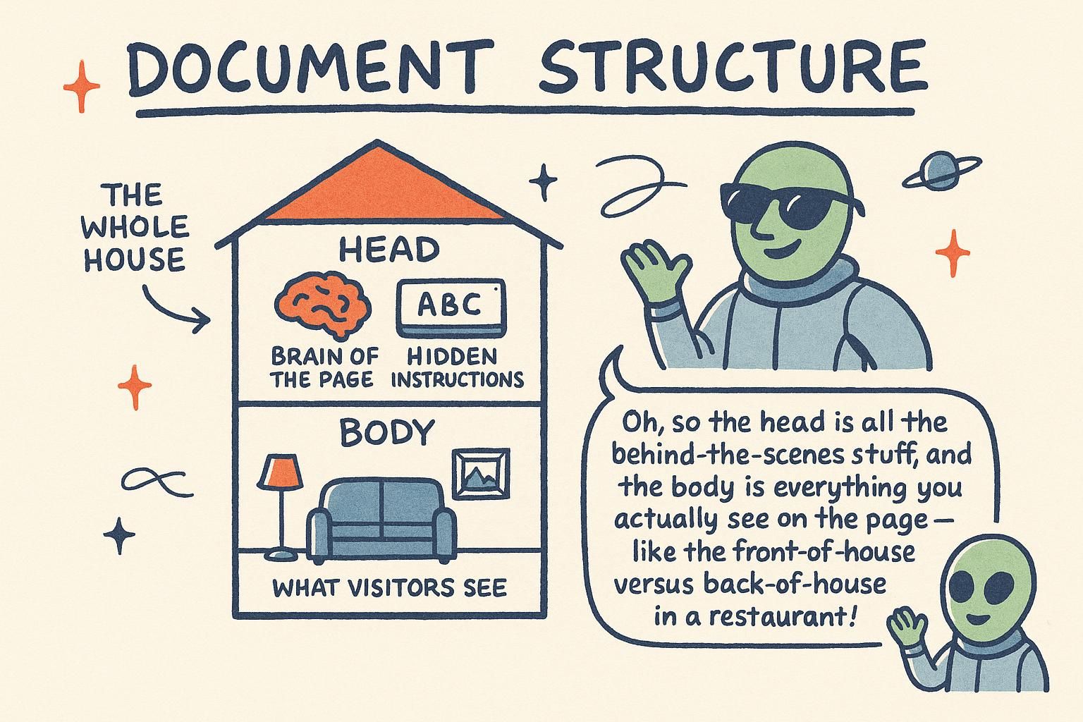
A page is not a flat pile of elements. Read one from top to bottom and it should hold together: a title, then the sections beneath it, each with its own heading, in an order that makes sense to move through. That shape is the page's outline, and it comes from two things working together. The headings name each part, and the landmark regions from the Semantic HTML chapter, <header>, <nav>, <main>, <aside>, and <footer>, group those parts into areas. This chapter is about how the two combine into a whole page.

How headings and landmarks form an outline

A web page reads from top to bottom, the same way you read a page in a book. Whoever visits starts at the top and works down, so the order your content sits in is the order visitors read it. Put things in the order someone would actually want to meet them.

Headings are what give that order a shape. A heading is a short label for the part that follows it, written with tags from <h1> down to <h6>. The <h1> is the title of the whole page. Each <h2> names a main section under it, and an <h3> names a smaller part inside an <h2>. Stack them up and you get the page's outline: a table of contents that mirrors the order of the page.

html
<h1>Sourdough for beginners</h1>
<h2>What you need</h2>
<h3>Ingredients</h3>
<h3>Equipment</h3>
<h2>Making the starter</h2>

Read the headings on their own and you already know what the page is about and how it is organised, before reading a single paragraph.

The structure of a page comes from two layers, and they answer different questions. The heading levels <h1> to <h6> form a nested hierarchy: <h1> is the page title, <h2> a top-level section, <h3> a subsection of that <h2>, and so on. Read the headings alone and you have the page's outline, a table of contents built straight from the markup.

The landmark elements form the second layer. <header>, <nav>, <main>, <aside>, and <footer> group the page into named regions, so instead of a nested list of topics you get a map of areas: this is the navigation, this is the main content, this is the footer.

html
<body>
  <header>
    <nav>...</nav>
  </header>
  <main>
    <h1>Sourdough for beginners</h1>
    <h2>What you need</h2>
    <h2>Making the starter</h2>
  </main>
  <footer>...</footer>
</body>

One structure tells you what the content is about (headings), the other tells you where each kind of content lives (landmarks). A well-built page has both.

An outline is the page's structure expressed as a hierarchy: the title at the top, its sections beneath, their subsections beneath those. Nothing draws this outline on screen. It lives in the markup, and its main audience is software that reads structure rather than pixels.

A screen reader (software that speaks a page aloud, or drives a braille display, for people who do not navigate by sight) builds two navigable structures from a page. The first is a list of every heading, <h1> to <h6>, kept in source order with its level, so a user can pull up all headings and jump straight to the one they want. The second is a list of landmarks, the regions marked by <header>, <nav>, <main>, <aside>, and <footer>, which lets them jump between whole regions instead of reading through everything in between. Each landmark element carries an implicit ARIA role (an accessibility label naming what kind of region it is, such as navigation or main), and that role is what the screen reader announces.

These two structures are the outline in practice. A sighted reader skims by scanning heading text down the page; a screen reader user skims by stepping through the same headings and regions. Same structure, reached two ways. That is the reason to build it deliberately: the outline is not decoration a few people rely on, it is how a large group reads at all.

JunoHow headings and landmarks form an outline Read a page top to bottom, like a book, so put things in the order people want them. Your headings, <h1> down to <h6>, are the skeleton: the <h1> is the page title, and everything nests under it. Read the headings on their own and you should already know how the page is laid out.
JunoHow headings and landmarks form an outline Two layers give a page its shape: heading levels build a nested table of contents, and landmarks like <main> and <nav> map out the regions. One says what the content is about, the other says where it lives. Build both and the page has a real structure, not only a look.
JunoHow headings and landmarks form an outline A screen reader builds two lists from your page: every heading with its level, and every landmark region. That pair is your outline, and it is how a lot of people actually read. So the structure is not a nicety for a few users, it is the reading experience itself, and it comes straight from the tags you chose.

One main, and correct heading order

Two habits keep an outline clean. First, give the page a single <h1>. It is the title of the page, and a page has one title, the way a book has one name on the cover. Everything else is <h2> and below.

Second, do not jump levels. After an <h2>, the next step down is <h3>, not <h5>. Skipping a level leaves a gap in the outline, like a contents page that lists chapter 1 and then chapter 4. Move one level at a time, down and back up:

html
<h1>Weeknight dinners</h1>
<h2>Pasta</h2>
<h3>Tomato and basil</h3>
<h3>Garlic butter</h3>
<h2>Salads</h2>
<h3>Greek</h3>

The content those headings sit in usually lives in one <main> region. <main> marks the primary content of the page, the part that is unique to this page and not the shared header, navigation, or footer. There is one <main>, the same as there is one <h1>.

A page has exactly one <main> landmark. It wraps the content that is unique to this page, and screen readers offer a jump straight to it, so a user can skip past the header and navigation that repeat on every page. Two <main> elements on one page break that promise and confuse the region map.

For headings, two rules hold the outline together. There is one <h1>, the page title. And heading levels descend by one: an <h2> is followed by <h3>, never straight to <h4> or <h5>. Choose a heading level for where it sits in the outline, never for how big it looks. The <h1> often lives directly inside <main> or in the page header, naming the thing the page is about.

html
<main>
  <h1>Weeknight dinners</h1>
  <h2>Pasta</h2>
  <h3>Tomato and basil</h3>
</main>

If a heading looks too large or too small, that is a styling problem. Set the size in CSS and leave the level to mean what it means.

There is one <main> per page (you may have more in the markup only if all but one are hidden, for example in a single-page app that keeps inactive views in the DOM). It carries the ARIA role main, the target of the "skip to main content" jump that keyboard and screen reader users rely on to bypass repeated navigation.

Heading levels carry more weight than they appear to, because of a piece of history worth knowing. For years the HTML spec described a document outline algorithm that would compute structure from the sectioning elements (<section>, <article>, <nav>, <aside>), so that an <h1> nested inside a <section> would be demoted to a second-level heading automatically. It was a clean idea. No browser ever implemented it, no screen reader used it, and it was eventually removed from the spec.

The practical consequence is simple and permanent: the outline is defined by your heading numbers alone. An <h1> nested three <section> elements deep is still a top-level heading to every browser and every screen reader. Nesting does not renumber anything for you. So keep one <h1>, descend one level at a time, and treat the number as the structural fact it is, never as a size dial.

JunoOne main, and correct heading order One <h1> per page, because a page has one title. Step heading levels down one at a time, <h2> then <h3>, no jumping to <h5>. And the main content of the page goes in one <main>. If a heading looks the wrong size, that is a job for CSS, not a reason to switch levels.
JunoOne main, and correct heading order One <main>, one <h1>, and levels that go down by one. Pick a heading for its place in the outline, never for the size it renders at, since size belongs in your stylesheet. The <main> is also the target of the skip link, so keeping a single one keeps that shortcut working.
JunoOne main, and correct heading order The old outline algorithm that would renumber headings by section nesting was never built and was dropped, so your heading numbers are the outline, full stop. An <h1> buried in three <section> elements is still an <h1> everywhere. Keep one <h1>, one <main>, and descend a level at a time.

Grouping and ordering content

Related content reads better when it is grouped. Two elements exist for this. A <section> is a themed chunk of a page that has its own heading, like the "Ingredients" part of a recipe. An <article> is a piece that stands on its own and would still make sense if you lifted it out, like a single blog post or a customer review.

html
<article>
  <h2>Slow-rise focaccia</h2>
  <p>A loaf that needs almost no kneading.</p>
</article>

Order matters as much as grouping. Because the page reads top to bottom, put the most important content near the top, and arrange the rest in the order a reader would want it. A recipe lists what you need before the steps, because that is the order you would follow it.

Use <section> for a thematic grouping of content that belongs under one heading, and <article> for a self-contained unit that could be distributed on its own, a blog post, a product card, a forum reply. Both should carry a heading so they show up in the outline; grouping content is only half the job if the group has no name.

The order you write elements in is the source order, and it carries more weight than it first appears. Source order is reading order and tab order. Reading order is what a screen reader speaks and what the page shows without CSS. Tab order is the order the keyboard moves through links and form controls when you press Tab. Both follow the source by default.

html
<main>
  <article>
    <h2>Slow-rise focaccia</h2>
    <h2>...</h2>
  </article>
</main>

CSS can move things around visually with flexbox or grid, but it does not change the source. So write your markup in the order the content actually reads, then style from there. Reorder in CSS and the visible order and the tab order stop matching, which is disorienting for anyone navigating by keyboard.

<section> and <article> group content, but neither generates a heading level. This is the outline algorithm point made concrete: a <section> does not add a rung to the outline, and a <section> with no heading inside it contributes nothing a screen reader can navigate to. Give every sectioning element a heading, or it is grouping the eye can see and the outline cannot.

Structure with skim-reading in mind, because almost nobody reads a page start to finish. Sighted users scan headings; screen reader users step through the heading and landmark lists. A descriptive <h2> every screenful, and content front-loaded so the point comes before the supporting detail, serves both. A wall of paragraphs with no headings is unreadable to a skimmer of either kind.

Then there is keyboard navigation, moving through a page with the Tab key rather than a mouse, which follows source order. The moment you reorder content visually with CSS order, flex-direction: row-reverse, or grid placement, the visual order and the source order diverge: focus jumps around the screen unpredictably as the user tabs, because the browser still follows the source. Reordering that a mouse user never notices becomes a maze for a keyboard user. The reliable rule is to make source order match the intended reading order, and reserve CSS reordering for changes that do not affect how the content should be read.

JunoGrouping and ordering content Group related content with <section> for a themed part that has a heading, and <article> for a piece that stands on its own, like a single post. Then mind the order: the page reads top to bottom, so the important things go near the top. Write it in the order someone would actually want to read it.
JunoGrouping and ordering content<section> groups content under a heading, <article> wraps a self-contained unit, and both want a heading so they land in the outline. The big one to keep: source order is reading order and tab order. Write the markup in the order it reads, then let CSS handle the look, or the keyboard path stops matching what people see.
JunoGrouping and ordering content A <section> without a heading is invisible to the outline, so every grouping earns a heading or it groups nothing a screen reader can reach. And source order is your tab order: reorder with CSS order or grid and focus starts hopping around the screen for keyboard users. Match source order to reading order and reorder in CSS only when it does not change how the content reads.

Common structural mistakes

A few structural mistakes show up again and again, and each has a clean fix.

  • Using a heading tag to make text big. Reaching for <h3> because it renders at the size you want breaks the outline. Pick the level by meaning, and set the size in CSS.
  • Skipping heading levels. Jumping from <h2> to <h4> leaves a hole in the outline. Go down one level at a time.
  • More than one <h1>. A page has one title. Extra <h1> tags muddle the table of contents.
  • No headings at all. A long run of paragraphs with nothing to break it up is hard to scan. Add headings so a reader can find their way.

Fix these and the page reads clearly for everyone, whether they are scanning with their eyes or listening to it read aloud. The Accessibility chapter goes further on making a page work for every visitor.

The common mistakes all come down to appearance standing in for structure.

Picking a heading level for its rendered size scrambles the outline, because the level is a structural signal and CSS already controls size. Skipping levels (an <h2> followed by an <h4>) leaves a gap that reads as a missing section. Multiple <h1> elements give the page more than one title and blur its table of contents. And faking a heading, styling a <p> or a <div> to look bold and large, gives you the look with none of the structure: it never appears in the heading list a screen reader builds.

Two more worth naming. An empty landmark, like a <nav> with nothing in it, adds a region that leads nowhere. And reordering content in CSS so the visible order no longer matches the source leaves keyboard users tabbing through the page in an order that does not match what they see. Keep structure in the HTML and appearance in the CSS, and most of these never happen.

Most structural failures are the same error in different clothes: appearance used where structure was needed. A <div> styled to look like a heading gives assistive technology nothing, because styling has no effect on the outline; only real heading elements enter the heading list. A skipped level reads to a screen reader user as a section that vanished. Several <h1> elements hand the page multiple titles and weaken the one shortcut most users lean on.

The subtler failures are about order and focus. Reordering with CSS so the visual and source orders diverge is invisible to a mouse user and disorienting to anyone tabbing through, because keyboard navigation follows the source. Positive tabindex values (an attribute that forces an element earlier in the tab order) make this worse by jumping focus around out of sequence; avoid them and let source order do the work. And a landmark with no accessible content, an empty <nav> or a <section> with no heading, adds a region to the map that leads nowhere.

The rule underneath all of it: build the structure in HTML so it is correct with no CSS at all, then style on top. A page whose outline holds up as plain, unstyled markup is one that holds up for every way it gets read. For more on the elements themselves, the Semantic HTML chapter is the companion to this one.

JunoCommon structural mistakes The big four: do not use a heading to make text big, do not skip levels, do not add a second <h1>, and do not leave a long page with no headings at all. Each one muddles the outline. Pick heading levels by meaning and let CSS handle the sizes.
JunoCommon structural mistakes Almost every structural bug is appearance standing in for structure: a heading chosen for its size, a bold <div> pretending to be a heading, a level skipped, two <h1> elements. A styled <div> never lands in the outline, so it is a heading only to the eye. Keep structure in the HTML, styling in the CSS, and these mostly disappear.
JunoCommon structural mistakes The tell in every case is styling doing structure's job: a fake <div> heading, a skipped level, empty landmarks, a CSS reorder that leaves keyboard focus hopping. Skip positive tabindex too, it drags focus out of order. Build markup that is correct with zero CSS, then style on top, and it reads right however someone gets to it.