
Skip to content

Accessibility

docs.scrimba.com

People reach the web in many ways. Some look at a screen and move a mouse. Some cannot see the screen and listen to it read aloud. Some never touch a mouse and move through a page with the keyboard, or with voice, or with a switch they press. Accessibility is the practice of building pages that all of them can use, and most of it comes down to writing HTML the way it was meant to be written.

Why accessibility matters

Accessibility means making sure everyone can use your page, whatever their circumstances and however they browse. Someone might not be able to see the screen and listen to it instead, through software that reads the page aloud. Someone might not use a mouse and move through the page with the keyboard. Someone might need larger text or stronger colours to read comfortably.

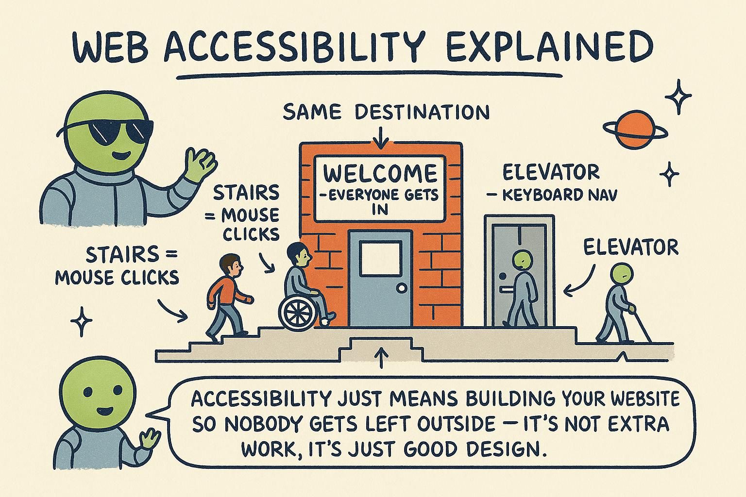
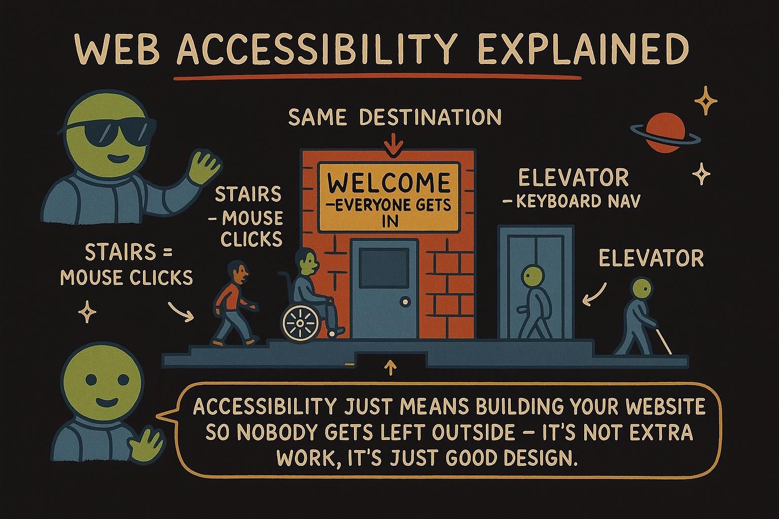
Think of a building with a ramp alongside the steps. The ramp helps people who cannot manage stairs, and it takes nothing away from anyone who can. Accessible HTML is the same idea: it opens the page to more people without making it worse for anyone.

The reassuring part is that HTML is accessible to start with. You get most of the way there for free by using the right element for each piece of content.

Accessibility, often shortened to a11y (an "a", then eleven letters, then a "y"), is about your page working across the full range of ways people access the web: screen readers that speak the page, keyboard-only navigation, voice control, screen magnification, and reduced-colour or high-contrast display modes.

The practical framing that helps most: HTML gives you accessibility as a starting position, not as something you add at the end. Most of the work is picking the correct element and not undoing what the browser already does for you. The failures tend to come from a small set of causes: custom widgets rebuilt from generic elements, form fields with no label, weak colour contrast, and behaviour that only responds to a mouse.

Accessibility is whether people using assistive technology (software or hardware that helps someone operate a computer, such as a screen reader that speaks the page, a switch device pressed instead of clicking, or voice control) can perceive, operate, and understand your page. The reference standard is WCAG, the Web Content Accessibility Guidelines, organised around four principles: content should be perceivable, operable, understandable, and robust.

Two consequences are worth holding onto. First, the same well-formed structure that assistive technology relies on is also what search engines and other machines read out of the DOM (the browser's in-memory model of the page), so accessibility and SEO pull in the same direction rather than competing for your time. Second, in many places accessibility is a legal requirement for public-facing sites, not a nice-to-have. The useful way to think about all of it: an accessible page is mostly a correctly built one. Almost everything in this chapter is standard HTML used as intended.

JunoWhy accessibility matters Accessibility means everyone can use your page, whoever they are and however they get there. The nice part is HTML hands you most of it for free the moment you pick the right element for the job. Picture a ramp next to the steps: more people get in, and nobody is worse off.
JunoWhy accessibility matters Accessibility is your page working for screen readers, keyboards, magnifiers, and everyone in between. You start from a good place because HTML is accessible out of the box, so most failures come from undoing that with custom widgets and missing labels. Build with the right elements and you are already most of the way there.
JunoWhy accessibility matters The standard is WCAG and its four principles: perceivable, operable, understandable, robust. The same structure that helps a screen reader helps a search crawler read the DOM, so this is not a separate tax on your time. Treat the rest of the chapter as ordinary HTML used as intended, because that is what most of it is.

Semantic HTML as the foundation

The single most effective thing you can do for accessibility is to use the element that matches the meaning of the content, rather than a generic one styled to look right.

Semantic HTML means choosing a tag for what the content is, not for how it looks. A heading uses <h1> to <h6>. A button uses <button>. A link uses <a>. A list uses <ul> or <ol>. Each of these already carries meaning that a screen reader can announce, so a listener knows "this is a button" or "this is a heading" without seeing it.

It is like labelling boxes when you move house. A box marked "kitchen" helps whoever carries it, not only the person who packed it. Semantic tags label your content in the same way, so the browser and assistive technology know what each part is.

In practice this means reaching for <button> when you want a button, not a <div> you have styled to look like one. The <div> can be made to look identical, but it says nothing about what it is. The Semantic HTML chapter goes through the full set.

Semantic elements arrive with behaviour and meaning already attached. A <button> is focusable, responds to Enter and Space, and is announced as a button. A <nav> marks a navigation region. Headings <h1> to <h6> form an outline that a screen reader user can jump through, the way a sighted reader skims for a section.

The rule that saves the most trouble: use the native element before you build your own. A <div role="button" tabindex="0"> with a click handler can be made to work, but you are re-implementing focus, keyboard support, and the role by hand, and one of those pieces tends to slip through. A real <button> gives you all of it at once. The landmark elements (<header>, <nav>, <main>, <aside>, <footer>) do the same job at page scale: they let a screen reader user skip straight to a region instead of listening through everything above it. The Semantic HTML chapter covers each one.

Semantic HTML is the foundation because the browser maps each semantic element to a role in the accessibility tree (the stripped-down version of the page that assistive technology reads, described in full in the ARIA section below). A <button> receives the button role, its focus behaviour, and its keyboard handling with no work from you. Rebuild it from a <div> and you inherit none of that: you now own focusability, key handling, and the announced role by hand, and every gap is a defect for someone.

Two habits carry most of the weight. Give heading levels a real structure: one <h1> for the page, then <h2> and <h3> nested without skipping a level, because screen reader users navigate by heading and a jump from <h2> to <h4> reads as a section that went missing. And use the landmark elements (<main>, <nav>, <header>, <footer>, <aside>) so the page exposes navigable regions. The failure mode to recognise is "div soup", a page assembled almost entirely from <div> and <span>: it renders perfectly and exposes almost nothing to assistive technology, because those two elements carry no role at all.

JunoSemantic HTML as the foundation Pick tags for what the content is, not how it looks: <button> for a button, <h1> for a heading, <a> for a link. Each one already tells a screen reader what it is, so you get that for free. A styled <div> can look the same and still say nothing.
JunoSemantic HTML as the foundation Native elements come with focus, keyboard support, and a spoken role already wired in, so a <button> beats a <div> pretending to be one. Use the real element before you rebuild it, and lean on landmarks like <nav> and <main> so people can skip around. That is most of the job right there.
JunoSemantic HTML as the foundation Every semantic element maps to a role in the accessibility tree, so <button> hands you the role, focus, and keys together, while a <div> hands you a bill for all three. Keep headings in order with no skipped levels, since people navigate by them. Div soup renders fine and tells assistive tech nothing, which is the whole problem with it.

Text alternatives, labels, focus, and keyboard

Some content cannot speak for itself. An image is invisible to a screen reader until you describe it. A form field is a guess until it is labelled. And a page that only responds to a mouse leaves out everyone who does not use one. These four areas are where a little care goes a long way.

A handful of reliable habits cover most of this:

  • Images need alt text. The alt attribute describes a picture for anyone who cannot see it. If the image is only decorative, an empty alt="" tells the screen reader to skip it.
html
<img src="red-fox.jpg" alt="A red fox curled up asleep in the snow">
  • Form fields need labels. A <label> tells both the visitor and the screen reader what to type in a field.
html
<label for="email">Email address</label>
<input id="email" type="email">
  • Buttons and links need clear text. "Read more" on its own is unclear when read out of context; "Read more about ticket prices" makes sense on its own.
  • Keyboard order should match reading order. Someone pressing Tab moves through the page in the order the elements appear in your HTML, so keep that order sensible.

The Images and media and Forms and inputs chapters go deeper on alt text and labels.

Associate every form control with a <label>. The reliable way is to match the label's for attribute to the input's id:

html
<label for="postcode">Postcode</label>
<input id="postcode" type="text" name="postcode">

Now clicking the label focuses the field, and a screen reader announces the label when the field gains focus. The Forms and inputs chapter covers the variations.

For alt text, describe the purpose, not the pixels: alt="Company logo" beats a list of colours and shapes, and a decorative image takes an empty alt="" so it is skipped rather than read as a file name.

Focus order follows the order of elements in the DOM, so keep your source order matching the visual reading order. Avoid positive tabindex values (tabindex="1" and up); they invent a separate tab sequence that is hard to keep correct. Use tabindex="0" to add a custom control to the natural order, and tabindex="-1" to make something focusable by script but not by Tab.

For keyboard operability the rule is short: everything you can do with a mouse must work with the keyboard. If a click opens a menu, Enter should too. And keep a visible focus outline so keyboard users can see where they are. Colour contrast matters here as well: WCAG asks for a contrast ratio of at least 4.5:1 between normal text and its background, and never rely on colour alone to carry meaning, since not everyone distinguishes the same colours.

These four areas are all places where the DOM has to carry meaning that visual layout carries for a sighted mouse user.

Labels. A <label> tied to a control by for/id, or by wrapping the input, gives that control its accessible name (the text assistive technology announces for an element). With no label, a screen reader reads the field's type and nothing about its purpose. Placeholder text is not a label: it disappears on input and is announced inconsistently.

Text alternatives. alt is the accessible name of an <img>. Write it by purpose, not appearance. A decorative image takes alt="" (empty, present but blank) so it is dropped from the accessibility tree; omitting alt entirely is different, and some screen readers fall back to reading the file name, which helps nobody.

Focus. Focus order is DOM order unless you override it, and positive tabindex is almost always a mistake because it builds a second tab sequence you then have to maintain against the visual layout. Use tabindex="0" to fold a custom control into the natural order and tabindex="-1" to make an element focusable only by script, which you need when moving focus after an action. Keep a visible focus indicator: never set outline: none without providing a replacement, or keyboard users lose track of their position. Watch too for a keyboard trap (focus that a keyboard user can move into but not out of), which WCAG calls out specifically.

Keyboard and contrast. Every operation should be reachable and operable by keyboard, in a logical order. For contrast, WCAG AA asks for 4.5:1 on body text and 3:1 on large text and on the visual boundary of a control, and meaning should never ride on colour alone. A required field marked only in red is invisible to someone who does not perceive that difference; pair it with text or an icon.

JunoText alternatives, labels, focus, and keyboard Four small habits carry most of this: give images an alt, give form fields a <label>, write button and link text that makes sense on its own, and keep the tab order matching the reading order. None of them take long. Decorative images get an empty alt="" so they get skipped.
JunoText alternatives, labels, focus, and keyboard Wire every input to a <label> with matching for and id, and write alt by purpose, empty for decorative. Keep focus order as DOM order and skip positive tabindex. The line to remember: anything a mouse can do, the keyboard must do too, and check your contrast hits 4.5:1.
JunoText alternatives, labels, focus, and keyboard Labels and alt set an element's accessible name, so a placeholder is not a label and a missing alt is not an empty one. Leave focus in DOM order, avoid positive tabindex, and never strip the focus outline without replacing it. Hit 4.5:1 on text and never let colour be the only signal, or a red-only required marker reaches nobody who cannot see the red.

ARIA, and why not to reach for it first

There is a set of HTML attributes made specifically for accessibility, called ARIA. It is useful in the right place, and it is one of the most misused parts of the platform, so it is worth understanding both what it does and when to leave it alone.

ARIA stands for Accessible Rich Internet Applications. It is a set of extra attributes you can add to an element to tell assistive technology more about it. The name makes it sound like the first tool to reach for, and it is usually the last.

The reason is simple: most of what ARIA can describe, HTML already says on its own. A <button> is already announced as a button. Adding role="button" to it changes nothing. If you find yourself adding ARIA to explain what an element is, that is usually a sign to swap in the plain HTML element that already says it.

Picture a sticky note added to a moving box. If the box is already printed "kitchen", a sticky note reading "kitchen" only adds clutter. Save the note for the box that has no label of its own. ARIA is for the parts of a page that HTML has no element for, which is rarer than it sounds.

ARIA adds three kinds of information to an element: roles (what it is, like role="dialog"), states (its current condition, like aria-expanded="false"), and properties (extra relationships, like aria-describedby pointing at some help text). Screen readers use these to announce custom widgets that have no native HTML equivalent, such as a tab panel or a slider.

The guidance to lead with is the first rule of ARIA: do not use ARIA if a native element already does the job. A native <button> beats <div role="button"> every time, because the native element brings behaviour and the ARIA attribute brings only a label. Worse, a wrong or stale ARIA attribute is worse than none, because it overrides what the browser would otherwise have said. Put aria-hidden="true" on the wrong element and you hide real content from screen reader users while it sits visible on screen. Reach for ARIA when you are building a widget HTML has no element for, and then follow an established pattern rather than inventing attributes.

Start with the thing ARIA edits. The accessibility tree is a parallel structure the browser builds alongside the DOM. For each element it records a role (what the element is: button, link, heading), its states and properties (conditions and relationships, such as aria-expanded, aria-checked, or disabled), and its accessible name and description (the text that gets announced). Assistive technology reads this tree, not your CSS and not the raw HTML.

ARIA is the vocabulary for editing that tree directly: roles (role="tablist"), states that change over time (aria-selected="true"), and properties that describe more stable relationships (aria-labelledby, aria-controls). The first rule of ARIA is that if a native HTML element or attribute already gives you the role, state, or property you need, use it and add no ARIA. The reason is that ARIA changes only the accessibility tree and adds no behaviour of its own. role="button" on a <div> makes a screen reader call it a button, but it grants no focusability, no Enter or Space handling, and no disabled support. You would add every one of those yourself, and the day you forget one you have a control that announces as a button but does not act like one, which is worse than an honest <div>.

A few rules keep ARIA from causing the harm it is meant to prevent. Prefer native elements. Do not override native semantics (no role="heading" on a <button>). Do not place interactive elements inside a subtree marked aria-hidden="true", or you make focusable controls that a screen reader cannot see. And keep states in sync with your JavaScript, since a stale aria-expanded lies to the user. When you do need ARIA, build from the WAI-ARIA Authoring Practices, the published patterns for common widgets, rather than composing attributes from scratch. To test any of this, the browser's accessibility inspector shows the computed role, name, and state for a given element, which is exactly what assistive technology will receive.

JunoARIA, and why not to reach for it first ARIA is a set of extra attributes that describe an element to assistive technology. It sounds like the first thing to reach for and it is usually the last, because a real <button> already says it is a button. Save ARIA for the rare part of a page that HTML has no element for, and keep everything else plain.
JunoARIA, and why not to reach for it first ARIA adds roles, states, and properties for custom widgets HTML has no element for. The first rule of ARIA is to skip it when a native element already does the job, since a wrong or stale attribute is worse than none. If you are labelling a <button> as a button, stop and use the button.
JunoARIA, and why not to reach for it first ARIA edits the accessibility tree: roles, states, and properties, and nothing else, so it never adds behaviour. That is the whole reason for the first rule of ARIA, since role="button" on a <div> announces a button that has no keys and no focus until you build them. Keep states in sync with your JavaScript, and when you do need a widget, copy a published pattern instead of inventing attributes.

A quick self-audit

You do not need specialist software to catch the most common problems. A few checks with tools already on your machine find the majority of them, and they take only a couple of minutes to run.

Here is a short checklist you can run on any page:

  • Set the mouse aside and press Tab. Can you reach every link and button, in an order that makes sense? Can you activate them with Enter?
  • Does every image have an alt attribute?
  • Does every form field have a <label>?
  • Do your buttons and links still make sense when read on their own?
  • Is the text clear to read against its background?

Running these on your own page is quick, and it catches the problems people hit most often. If the Tab key gets stuck somewhere, or an image has no alt, you have found something worth fixing.

Build a repeatable pass into your workflow:

  1. Keyboard. Tab through the whole page. Every interactive element should be reachable, in a sensible order, with a visible focus indicator, and operable with Enter or Space. If focus vanishes or gets stuck, fix that before anything else.
  2. Headings and landmarks. Confirm there is one <h1>, that headings do not skip levels, and that the main regions use <main>, <nav>, and the other landmarks.
  3. Names. Every image has an alt, every control has a label, and every link and button reads clearly out of context.
  4. Contrast. Check text against its background in your browser's dev tools, which report the ratio and flag anything that fails.

Automated checkers such as the Lighthouse panel in Chrome dev tools or the axe browser extension catch a useful share of issues, but only a share. They cannot judge whether an alt text is meaningful or whether a tab order makes sense, so the manual keyboard pass stays essential.

A working audit combines automated and manual passes, because automation covers only part of the ground: tooling reliably finds missing alt, missing labels, and contrast failures (roughly a third of the WCAG criteria), and it cannot judge whether an alt text is accurate or a tab order is logical.

  • Automated. Run axe or Lighthouse first to sweep up the mechanical failures.
  • Keyboard. Set the mouse aside and Tab through, confirming reachability, a logical order, a visible focus ring, full operability, and no place where focus cannot get back out. This pass alone surfaces most custom-widget defects.
  • Screen reader. Turn one on (VoiceOver ships with macOS via Cmd+F5, NVDA is a free download on Windows, TalkBack is built into Android) and listen through a few key flows. You are checking that names are announced, roles are right, and state changes are actually spoken.
  • The accessibility tree. The browser's dev tools show the computed role, name, and state for any element, which tells you what assistive technology will really receive, independent of how the element looks.

Run the keyboard and screen reader passes even when the automated tools report green, because the things they cannot check are the things that most affect a real person using the page.

JunoA quick self-audit Set the mouse aside and Tab through your page: can you reach and use everything in a sensible order? Then check every image has an alt, every field has a <label>, and the text reads clearly against its background. A couple of minutes of this catches the problems people hit most.
JunoA quick self-audit Make it a routine: Tab through for reachability and order, check one <h1> and no skipped headings, confirm names on images and controls, and read the contrast in dev tools. Automated tools like axe and Lighthouse help, but they only catch part of it, so keep doing the keyboard pass by hand.
JunoA quick self-audit Automation finds missing alt, missing labels, and contrast, about a third of WCAG, and judges nothing about meaning or order. So pair it with a keyboard pass, a listen through a screen reader, and a look at the accessibility inspector for the computed role and name. The checks a tool cannot run are the ones that matter most, so run them yourself even when the report is green.