
Skip to content

Images and media

docs.scrimba.com

Text carries a lot of a web page, but not all of it. Photos, diagrams, illustrations, video clips, and sound are content too, and HTML has elements for each of them. This chapter is about the markup that puts media on a page: how you point to an image file, how you describe it for people who cannot see it, and how you serve the right file to the right screen without wasting anyone's data.

The image element

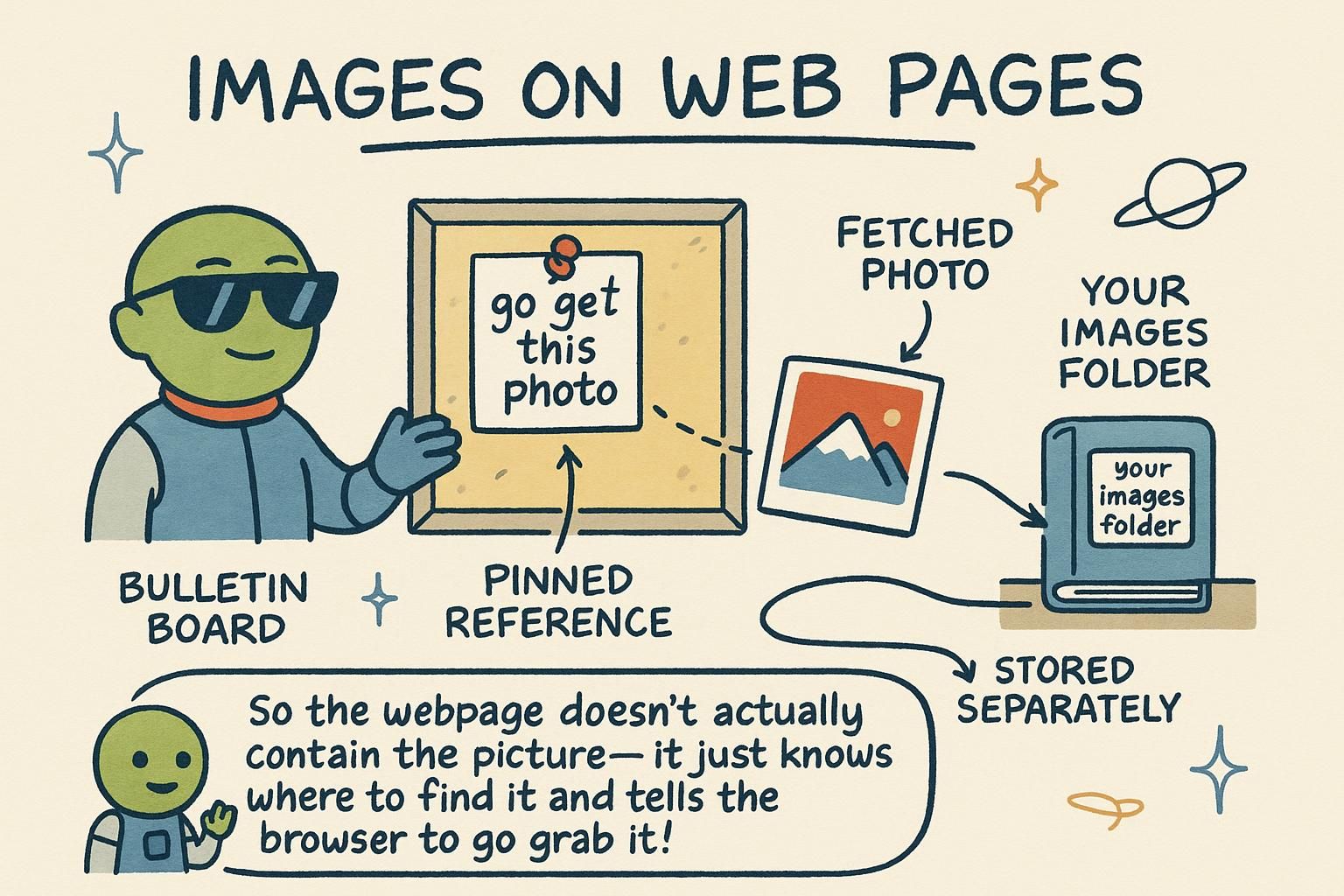
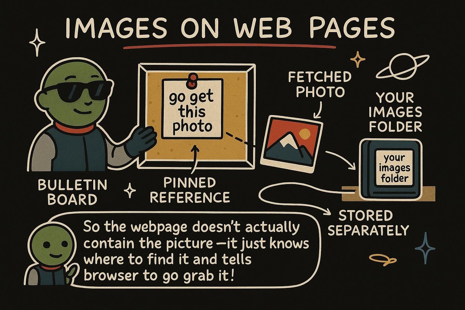
You put a picture on a page with the image element, written as <img>. It has no content and no closing tag. Instead, you tell it two things through attributes: which file to show, and what the picture is of.

html
<img src="golden-retriever.jpg" alt="A golden retriever sitting in tall grass">

src is the source: the path or web address of the image file. alt is the alternative text: a short description of the picture in words. If the image cannot load, or if someone is listening to the page with a screen reader instead of looking at it, the alt text is what they get. So write it as if you were describing the picture to a friend on the phone.

The <img> element pulls an external file into the page. It is a void element, so it has no closing tag; everything it needs lives in its attributes. Two are load-bearing:

html
<img src="/images/team-photo.jpg" alt="The five members of the design team at their desks">

src is the file's path, relative to the page or an absolute URL. alt is the alternative text, the words that stand in for the image when it does not display or cannot be seen.

Getting alt right is the part people skip and should not. Describe the image's content and purpose, not its file details. "Bar chart showing sales doubling between 2023 and 2024" tells the reader what the chart says; "chart.png" tells them nothing. Keep it to a sentence, and do not start it with "Image of", the browser already announces that it is an image.

<img> is a void element that loads an external resource and lays it out inline with text by default. Two attributes do the real work: src (the resource URL) and alt (the text alternative). The rest of this section is about alt, because it is where the accessibility and correctness of an image actually live.

The alt attribute is not a caption and not a description of the file. It is a replacement: the text a browser renders in the image's place when the image is absent, and the text a screen reader (software that reads a page aloud for people who cannot see it) speaks instead of the picture. The test is functional equivalence. If you removed the image and dropped your alt text into the flow, would the sentence still make sense and carry the same information? Good alt passes that test; "photo1" does not.

Two rules follow from this. First, describe purpose, not pixels: a magnifying-glass icon inside a search button has alt="Search", not alt="magnifying glass", because its job on the page is the action, not the drawing. Second, decorative images take an empty alt. When a picture adds no information, a background flourish or a divider, write alt="" with nothing between the quotes. That is not the same as leaving alt off. An empty alt tells assistive technology "skip this, it carries no meaning", while a missing alt makes a screen reader fall back to reading the file name aloud, which is worse than silence.

html
<!-- Meaningful: describe what it communicates -->
<img src="revenue-2024.png" alt="Revenue rose from 1.2 to 2.4 million across 2024">

<!-- Decorative: empty alt, so assistive tech skips it -->
<img src="corner-flourish.svg" alt="">
JunoThe image element An image needs two things: src, which is the file to show, and alt, which describes the picture in words. Write the alt as if you were telling someone on the phone what is in the photo. It is the bit that gets skipped most, and it is the bit that matters most.
JunoThe image element<img> is a void element: no closing tag, everything in the attributes. Describe what the image says, not the file, and never open with Image of, the browser already knows it is an image. A chart's alt should tell someone the number the chart is making.
JunoThe image element Good alt is a replacement, not a caption: drop it into the sentence and the meaning should survive. Describe the job, not the drawing, so a search icon reads Search. And alt="" for decorative images is a real choice, it tells a screen reader to skip, where a missing alt makes it read the file name out loud.

Responsive images

A photo that looks sharp on a laptop can be far bigger than a phone needs. Sending that full-size file to a small screen wastes the visitor's data and slows the page down. HTML lets you offer the browser a few versions of the same picture and let it pick the one that fits.

You do not need this for every image while you are starting out. A single <img> with a sensible file is fine. But it helps to know the idea exists: the same photo can come in several sizes, and the browser chooses.

html
<img src="beach-800.jpg" alt="Waves rolling onto a quiet beach at sunset">

Responsive images let the browser choose a file based on the screen. Instead of hard-coding one source, you list several with srcset and describe how wide the image will display with sizes. The browser does the maths and downloads the best match.

html
<img
  src="beach-800.jpg"
  srcset="beach-400.jpg 400w, beach-800.jpg 800w, beach-1600.jpg 1600w"
  sizes="(max-width: 600px) 100vw, 50vw"
  alt="Waves rolling onto a quiet beach at sunset">

In srcset, each entry pairs a file with its real pixel width (400w means the file is 400 pixels wide). In sizes, you tell the browser how much space the image will take: here it fills the whole viewport width (100vw) on screens up to 600 pixels, and half the width (50vw) otherwise. The src stays as a fallback for older browsers. Note the alt is written once and applies to every source, because they are all the same picture.

When you need more than a size swap, reach for <picture>. It wraps several <source> elements and one <img>, and the browser uses the first <source> that matches. This handles art direction, serving a differently cropped image at different widths, and modern file formats:

html
<picture>
  <source srcset="hero.avif" type="image/avif">
  <source srcset="hero.webp" type="image/webp">
  <img src="hero.jpg" alt="Two cyclists climbing a mountain road at dawn">
</picture>

The browser reads top to bottom, picks the first format it understands, and falls back to the plain <img> if none match. The <img> inside is required; it is what actually renders and where alt lives.

Responsive images solve a resolution-switching problem: the same image, different pixel dimensions for different displays, chosen by the browser before download so nobody pays for pixels they cannot see. There are two tools, and they answer different questions.

srcset with sizes answers "which resolution?". You give the browser a set of candidate files, each tagged with its intrinsic width in pixels using the w descriptor, and a sizes value telling it how wide the image will render at various breakpoints. A breakpoint is a screen-width threshold at which the layout changes. The browser combines your sizes hint with the device's pixel density to pick the smallest file that still looks sharp.

html
<img
  src="product-800.jpg"
  srcset="product-400.jpg 400w, product-800.jpg 800w, product-1200.jpg 1200w"
  sizes="(max-width: 700px) 100vw, 350px"
  alt="Leather backpack shown from the front">

The <picture> element answers a different question: "which source entirely?". It is for cases where the file itself should change, not just its scale. Two common reasons. Art direction, where a wide banner crops to a tall portrait on narrow screens so the subject stays visible, needs different image files, not one file scaled down. And format negotiation, where you offer a modern format with a fallback, needs the browser to pick by what it can decode.

html
<picture>
  <source media="(max-width: 600px)" srcset="hero-portrait.avif" type="image/avif">
  <source media="(max-width: 600px)" srcset="hero-portrait.jpg">
  <source srcset="hero-wide.avif" type="image/avif">
  <img src="hero-wide.jpg" alt="Chef plating a dish in a busy kitchen">
</picture>

Order matters: the browser takes the first <source> whose media and type it satisfies, so put your most preferred and most constrained options first. The trailing <img> is mandatory and is the element the page actually renders; srcset and sizes on the sources feed it, but alt, width, height, and loading behaviour all belong on that inner <img>.

JunoResponsive images The same photo can come in a few sizes, and the browser can pick the one that fits the screen so a phone does not download a laptop-sized file. You do not need this on day one; a plain <img> is fine. The option is there for when a page starts feeling heavy on mobile.
JunoResponsive images Use srcset and sizes when you want the browser to pick a size, and <picture> when you want to swap the file itself, for a different crop or a modern format. The <img> inside <picture> is required and is where alt lives. Write the alt once; every source is the same picture.
JunoResponsive images Two different jobs: srcset plus sizes picks a resolution, <picture> picks a whole source for art direction or format negotiation. Sources are read top to bottom, first match wins, so order most-constrained first. Everything that renders still hangs off the inner <img>, so that is where alt and sizing go.

Video and audio

HTML can play video and sound without any plug-ins. For a clip, you use the <video> element; for sound, <audio>. Add the controls attribute and the browser gives you a play button, a timeline, and a volume control for free.

html
<video src="tutorial.mp4" controls></video>

<audio src="podcast-episode.mp3" controls></audio>

Unlike an image, these have a closing tag, because you can put fallback text or extra settings between the opening and closing tags. The most important thing to remember early on: always include controls, or the visitor has no way to press play.

The <video> and <audio> elements embed a native media player in the page. The controls attribute shows the browser's built-in play, pause, seek, and volume interface; without it, there are no controls at all.

html
<video src="product-demo.mp4" controls width="640" poster="demo-cover.jpg"></video>

A few attributes earn their place. poster sets a still image shown before the video plays, so the player is not a black box. width reserves the player's size. You can also add autoplay, loop, and muted, though most browsers only allow autoplay when the video is also muted, so those two travel together.

To offer more than one file format, drop the src and list <source> elements inside instead. The browser plays the first one it can:

html
<video controls width="640" poster="demo-cover.jpg">
  <source src="product-demo.webm" type="video/webm">
  <source src="product-demo.mp4" type="video/mp4">
  Your browser cannot play this video.
</video>

The text after the sources is fallback content, shown only if the browser cannot play any of them. <audio> works the same way, with the same controls and <source> pattern, minus the visual attributes like poster and width.

<video> and <audio> embed the browser's native media pipeline, decoding, buffering, and a built-in player UI, without a third-party plug-in. Both take controls (show the native UI), and both accept multiple <source> children so you can offer several codecs (the compression formats a video or audio file is encoded in) and let the browser pick the first it can decode.

html
<video controls width="640" height="360" poster="demo-cover.jpg" preload="metadata">
  <source src="demo.webm" type="video/webm">
  <source src="demo.mp4" type="video/mp4">
  <track kind="captions" src="demo-captions.en.vtt" srclang="en" label="English" default>
  Your browser cannot play this video.
</video>

Two production concerns dominate here. The first is accessibility, making the media usable by people who cannot hear or see it. That is what <track> is for: it attaches a timed text file, usually in WebVTT format (a plain-text caption format, files ending .vtt), to the media. kind="captions" provides a text version of speech and important sound for viewers who are deaf or in a sound-off setting, which is most people scrolling in public. kind="subtitles" translates dialogue into another language. The default attribute turns one track on without the user hunting for it. Video without captions excludes a real slice of your audience, and captions also help search engines, which cannot watch a video but can read a transcript.

The second concern is bandwidth. preload controls how eagerly the browser fetches the media before play: preload="none" downloads nothing until the user presses play, preload="metadata" grabs only duration and dimensions, and preload="auto" may pull the whole file. Default to metadata or none for anything below the fold, because an autoloading video is one of the heaviest things a page can silently do. And the same autoplay caveat holds: browsers block sound-on autoplay, so an autoplaying video must be muted, which is another reason captions matter.

JunoVideo and audio<video> plays a clip and <audio> plays sound, no plug-ins needed. Add controls or there is no play button and the visitor is stuck. Both have closing tags, because you can tuck settings and fallback text inside them, unlike an image.
JunoVideo and audio Always add controls, set a poster so the player is not a black rectangle, and list <source> elements to offer more than one format. autoplay only fires if the video is muted, so those two go together. Audio is the same pattern without the visual attributes.
JunoVideo and audio Add a <track> with captions; most people watch muted, and search engines read the text they cannot watch. Keep preload at metadata or none for anything below the fold, an autoloading video is one of the quietest ways to make a page heavy. And sound-on autoplay is blocked, so autoplay means muted, which is one more reason to caption.

Sizing, lazy loading, and performance

When an image loads, it can push the rest of the page around. You are reading a paragraph, a photo finishes loading above it, and suddenly the text jumps down. That jump is annoying, and you can prevent it: tell the browser the image's size up front with width and height.

html
<img src="team-lunch.jpg" alt="The team sharing lunch on the office balcony"
     width="800" height="600">

With those numbers, the browser reserves the right amount of space before the image arrives, so nothing jumps when it does. You give the real pixel dimensions of the file, and CSS can still resize it on screen.

Images affect two things you feel as a user: how much the page shifts while loading, and how much data it pulls. HTML gives you attributes for both.

Setting width and height prevents layout shift, content jumping around as images load in. When you declare the dimensions, the browser reserves that space immediately instead of collapsing the image to nothing and then expanding it once the file arrives.

html
<img src="article-header.jpg" alt="Overhead view of a busy newsroom"
     width="1200" height="675" loading="lazy">

The loading="lazy" attribute tells the browser not to download the image until the reader is about to scroll it into view. For images far down a long page, that saves data and speeds up the first paint. One rule: do not lazy-load the image the visitor sees first, at the top of the page. That one you want loaded as fast as possible, so leave loading off it (or set loading="eager").

Media is usually the heaviest part of a page, so the attributes that govern its loading are performance controls, not decoration. Three matter.

First, cumulative layout shift, a measure of how much visible content jumps around while the page loads. The usual cause is an image with no declared size: the browser gives it zero height, lays out everything below it, then reflows the whole column once the file arrives and its real height is known. You prevent this by giving the browser the aspect ratio ahead of time. Set width and height to the file's real pixel dimensions, and the browser computes the ratio and reserves the right box even while CSS resizes the display:

html
<img src="feature.jpg" alt="Solar panels across a green field"
     width="1600" height="900" loading="lazy" decoding="async">

You can express the same intent in CSS with the aspect-ratio property; the point is that the ratio must be knowable before the pixels download.

Second, loading="lazy" defers the download of off-screen images until the reader nears them, cutting the initial payload on long pages. The critical exception is your LCP element (Largest Contentful Paint, the largest image or block visible without scrolling, and a metric browsers and search ranking watch). Lazy-loading that image delays the very thing the metric measures, so the above-the-fold hero should load eagerly.

Third, decoding="async" lets the browser decode the image off the main thread, so turning compressed bytes into pixels does not block other rendering. It is a small, safe win for images that are not the first thing on screen.

Format is the other lever. WebP and AVIF are modern image formats that compress far smaller than JPEG or PNG at the same visual quality; AVIF typically wins on file size, WebP on browser support and encode speed. The trade-off is compatibility and tooling, which is exactly what <picture> with type sources is built to manage: offer AVIF first, WebP next, and a JPEG or PNG fallback last, and every browser gets the best file it can actually decode.

JunoSizing, lazy loading, and performance Give every image a width and height and the page stops jumping around as photos load in. Use the real pixel size of the file; CSS can still shrink it on screen. This one habit fixes the most annoying loading glitch there is.
JunoSizing, lazy loading, and performancewidth and height reserve space so nothing shifts as images load, and loading="lazy" holds off downloading images until they are about to scroll into view. The one image not to lazy-load is the first one on the page; that one should load straight away.
JunoSizing, lazy loading, and performance Declare width and height (or set aspect-ratio) so the browser reserves the box and layout stops jumping; the ratio just has to be known before the pixels land. Lazy-load everything except the above-the-fold hero, since lazy-loading your largest visible image slows the metric that watches it. And serve AVIF or WebP through <picture> with a JPEG fallback so every browser gets the smallest file it can decode.