
 Learn HTML & CSS
Transitions and animations
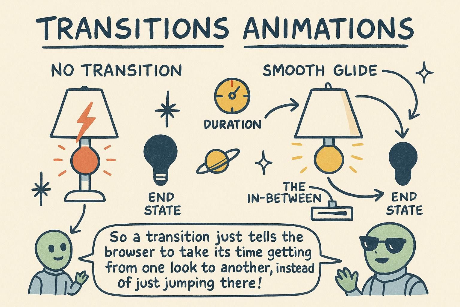
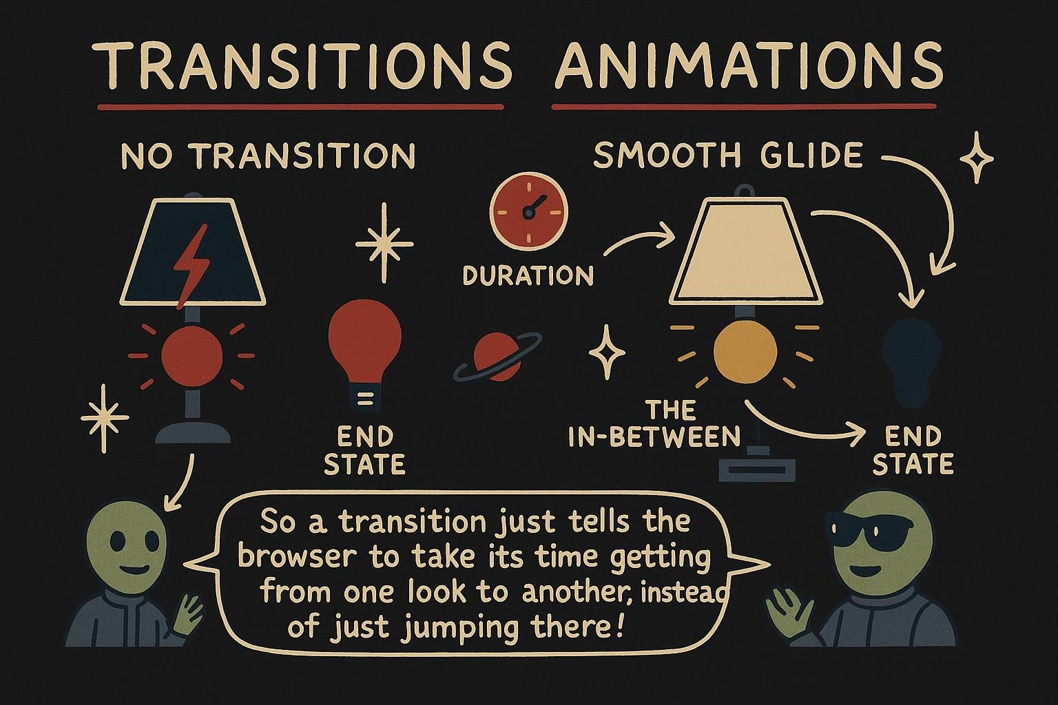
You add a :hover colour to a button and it works, but the change is abrupt: one frame it is blue, the next it is darker, with nothing in between. A tiny fade would make the whole page feel less jumpy. That fade is a transition, and once you can describe motion between two states, the same tools scale up to hover effects, cards that lift, and a spinner that turns while something loads. This chapter is about how CSS moves things, and how to move them without making the page harder to use.
Transitions
A transition tells the browser to animate a property from its old value to a new one instead of snapping between them. You describe two states, the normal one and the hover one, and the transition fills in the frames in between.
Here is a button that changes colour on hover. Without a transition the colour jumps; with one it fades:
.btn {
  background: #3b82f6;
  transition: background 0.2s;   /* fade the colour over 0.2 seconds */
}
.btn:hover {
  background: #1d4ed8;           /* the new state to animate towards */
}
You put transition on the normal state, not on :hover. That way it applies both when the mouse arrives and when it leaves.

:hover, so it works going in and coming back out. Start with property and a duration and you already have a working fade. Transforms
A transform moves, scales, or rotates an element without disturbing anything around it. It is the thing you usually want to animate, because it looks smooth and does not shove neighbours out of the way.
There are three you will reach for constantly:
.card:hover {
  transform: translateY(-4px);   /* move up 4 pixels */
}
.icon:hover {
  transform: scale(1.1);         /* grow to 110% of its size */
}
.arrow.open {
  transform: rotate(90deg);      /* turn a quarter turn clockwise */
}
translate moves, scale resizes, and rotate turns. Pair any of these with a transition and you get a card that lifts, an icon that pops, or an arrow that swings open.
transform moves, scales, or rotates an element without pushing its neighbours around. The three to remember are translate to move, scale to resize, and rotate to turn. Combine it with a transition and you get a card that lifts or an icon that pops on hover. Keyframe animations
A transition animates between two states. When you need more than two, or you need the motion to repeat, you use a keyframe animation. You write out the steps with @keyframes, then attach them to an element with the animation property.
A loading spinner is the classic example: it turns forever, so a transition cannot do it.
@keyframes spin {
  from { transform: rotate(0deg); }
  to   { transform: rotate(360deg); }
}
.spinner {
  animation: spin 1s linear infinite;   /* run spin, 1s per turn, forever */
}
from is the start and to is the end. The animation line says which keyframes to run, how long one cycle takes, the speed curve, and how many times to repeat. infinite means it never stops.
@keyframes and run them with animation. A spinner is the go-to example: from at 0 degrees, to at 360, looping with infinite. The animation line sets which keyframes, how long, the curve, and how many times. Motion that respects the user
Not everyone wants motion on the screen. Some people find it distracting, and for some it can cause real discomfort or nausea. Browsers let people ask for less of it in their system settings, and CSS can read that request with prefers-reduced-motion.
Wrap your animations in a check so they only run for people who have not asked to turn motion down:
@media (prefers-reduced-motion: no-preference) {
  .card {
    transition: transform 0.2s;
  }
}
The other half of respecting the user is restraint: keep motion short, subtle, and tied to something the reader did, like a hover or a click. Motion that draws attention to a real change helps; motion for its own sake gets tiring fast.
prefers-reduced-motion and only run animations for people who have not turned motion down. Keep the motion you do add short, subtle, and tied to something the reader did. What to animate, and why it matters
A quick rule that will save you trouble later: when you animate movement, animate transform and opacity, not properties like width, height, top, or margin.
/* smooth: the browser handles these cheaply */
.card:hover {
  transform: translateY(-4px);
  opacity: 0.9;
}
The reason is that transform and opacity are the two properties browsers can move around most cheaply, so animations built on them stay smooth even on slower devices. Animating size or position properties makes the browser do more work every frame, and the motion can stutter. You will meet the full reason when you go deeper, but the habit is worth building now.
transform and opacity, and steer away from animating width, height, top, or margin. Those two are the cheapest for the browser to move, so the motion stays smooth even on slower devices. You will learn the full why later, but the habit is worth starting now.