

 Learn HTML & CSS
The box model
Once you start spacing things out with CSS, you run into the same puzzle everyone does: you set a width, add some padding, and the element comes out wider than you asked for. Two paragraphs sit closer together than the numbers say they should. None of this is a bug. It is the box model, the set of rules that decides how much room every element takes up, and once you can picture it, most of your spacing surprises stop being surprises.
Every element is a box
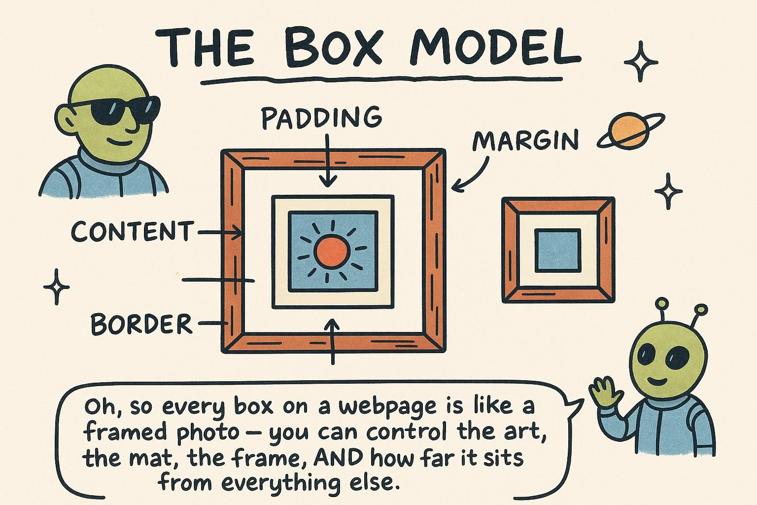
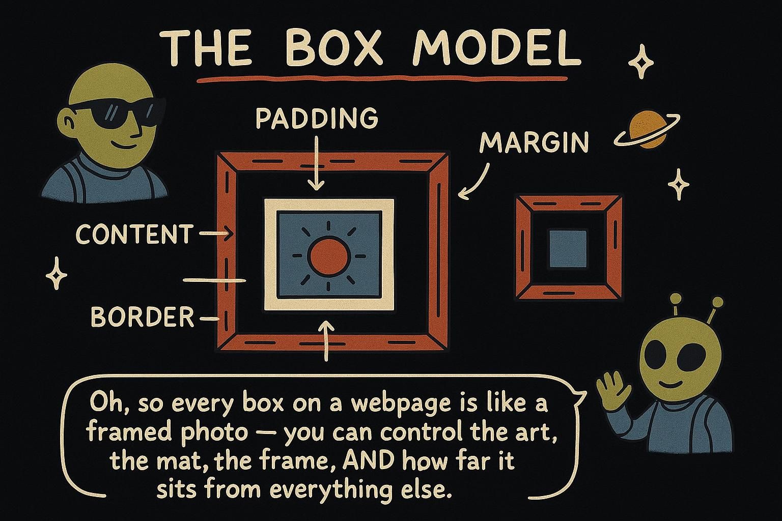
CSS treats every element on the page as a rectangle, even a single word or a link. That rectangle is built from four layers stacked from the inside out, and this is the box model: the content in the middle, then padding around it, then a border, then margin on the outside.
Picture a framed photo on a wall. The photo is the content. The white mat around the photo is the padding, breathing room inside the frame. The wooden frame itself is the border. And the empty wall between this frame and the next one is the margin. Every element you style is packaged the same way, from the inside out.
.card {
  padding: 16px;              /* space inside, around the content */
  border: 2px solid #333;     /* the frame */
  margin: 24px;               /* space outside, pushing neighbours away */
}
padding, border, and margin
The three spacing layers each do one job. Padding is space on the inside, between the content and the border. Margin is space on the outside, pushing other elements away. The border is the line drawn between them.
You can set one value for all four sides at once, or target a single side:
.card {
  padding: 20px;             /* all four sides get 20px */
  margin-bottom: 32px;       /* only the bottom edge */
}
The shorthand padding: 20px is a quick way to say top, right, bottom, and left all together. When you need one side different from the rest, reach for the specific property like margin-bottom.
padding when text feels cramped inside a box, and margin when two boxes sit too close together. One value like padding: 20px covers all four sides, or name a side like margin-bottom when only one needs to change. box-sizing: content-box vs border-box
Here is the surprise that catches almost everyone. You set a card to width: 300px, add some padding, and the card ends up wider than 300 pixels on the page. You did not do anything wrong. By default, width only measures the content in the middle, and any padding and border get added on top.
There is a one-line fix that makes width behave the way you expected. Set box-sizing: border-box, and now the width you type is the full width of the box, padding and border included:
.card {
  box-sizing: border-box;    /* width now includes padding and border */
  width: 300px;
  padding: 20px;             /* the card stays 300px wide, not 340px */
}width you set only measures the content in the middle, so padding and border make the box bigger than the number you typed. Setting box-sizing: border-box fixes that: the width becomes the full box, padding and border included. This one caught me out for ages, so it is worth remembering early. Margin collapsing
One more surprise, and it is about margins stacking. Put two paragraphs on top of each other, give the first a 24px bottom margin and the second a 16px top margin, and you might expect 40px of gap between them. You actually get 24px.
This is called margin collapsing. When two vertical margins meet, the browser does not add them together. It keeps the larger of the two and throws the smaller one away. So the bigger margin wins, and the gap is 24px, not 40px. It only happens with top and bottom margins, never with padding.
.intro {
  margin-bottom: 24px;
}
.details {
  margin-top: 16px;
  /* the gap between them is 24px, the larger margin, not 40px */
}24px below meeting 16px above gives a 24px gap, not 40px. It only happens with top and bottom margins, and it surprises everyone the first time.