

 Learn HTML & CSS
Positioning and z-index
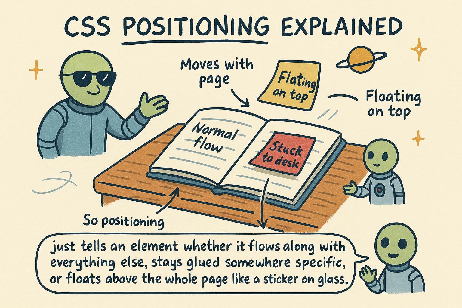
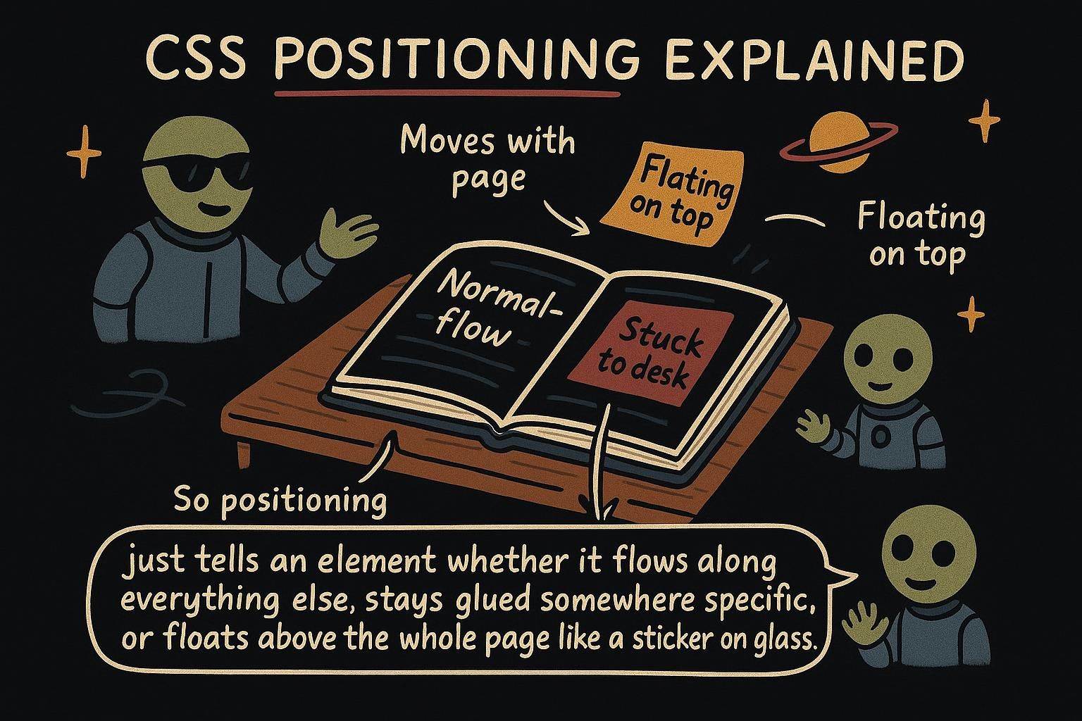
You want a small "Sale" badge to sit on the top-right corner of a product photo. You want a header that stays put while the page scrolls under it. You want a dialog that floats above everything else on the page. Ordinary CSS spacing cannot do any of this, because it only ever arranges elements one after another. Positioning is the set of tools that lets an element step out of that ordinary arrangement and sit exactly where you point it, even on top of something else.
The position property
Every element starts with static positioning, which is a plain way of saying "sit in your normal spot in the flow of the page". That is the default, and most of the time it is what you want. Positioning starts to matter when you want an element to move away from that normal spot.
The first step up is position: relative. It nudges an element from where it would normally sit, using four offset properties: top, right, bottom, and left. The key thing is that the element keeps its original space. Nothing else moves to fill the gap.
.badge {
  position: relative;
  top: 10px;                 /* pushed 10px down from its normal spot */
  left: 20px;                /* pushed 20px right from its normal spot */
}
Those top and left offsets do nothing at all on a static element. They only start working once you give the element a position other than static.

static, meaning it sits in its normal spot. Switch to position: relative and you can nudge it with top, right, bottom, and left, while its original space stays reserved. Those offset properties do nothing until the element is positioned, so if top seems ignored, check that you set a position first. Absolute positioning
position: absolute is a bigger move. It lifts the element clean out of the normal flow, so it no longer takes up any space, and the elements around it close up as if it were never there. Then you place it using the same top, right, bottom, and left offsets.
The question is: offset from what? An absolute element positions itself against its nearest positioned ancestor, meaning the closest parent that has a position of its own (anything other than static). This is why the badge-on-a-card pattern always comes in a pair: you make the card relative so it becomes the reference point, then make the badge absolute so it can sit in the card's corner.
.card {
  position: relative;        /* becomes the reference point */
}

.card .badge {
  position: absolute;
  top: 8px;                  /* 8px from the top of the card */
  right: 8px;                /* 8px from the right of the card */
}
Without position: relative on the card, the badge would search further up the page for a positioned ancestor and land somewhere you did not intend.
position: absolute pulls an element out of the flow, so it takes up no space and neighbours close in behind it. It then positions against its nearest parent that has a position set. That is why the badge-on-a-card trick is a pair: relative on the card, absolute on the badge, so the badge lands in the card's corner and not somewhere random. Fixed and sticky
position: fixed pins an element to the screen itself. It leaves the flow like absolute does, but instead of anchoring to a parent, it anchors to the viewport, the visible window. Once fixed, it stays in the same place on screen even as you scroll the page. This is how a navigation bar or a "back to top" button stays visible the whole time.
.site-header {
  position: fixed;
  top: 0;                    /* pinned to the top of the window */
  left: 0;
  right: 0;                  /* stretched across the full width */
}
position: sticky is the friendly middle ground. A sticky element scrolls along with the page normally, until it reaches a threshold you set, and then it sticks in place. A section heading that scrolls up with its content and then holds at the top of the screen is the classic example.
.section-title {
  position: sticky;
  top: 0;                    /* sticks once it reaches the top edge */
}position: fixed pins an element to the screen, so it stays put as you scroll, which is how a header or a back-to-top button hangs around. position: sticky is the middle ground: it scrolls with the page, then sticks once it reaches a threshold like top: 0. Fixed also overlaps whatever is below it, so leave some room for the content it covers. Stacking with z-index
When elements overlap, something has to decide which one sits on top. That is what z-index controls. A higher z-index draws in front of a lower one, so a dropdown with z-index: 10 covers a card with z-index: 1.
There is one rule that trips everyone up: z-index only works on positioned elements. If an element is still static, its z-index is ignored. So you almost always set a position and a z-index together.
.modal {
  position: fixed;
  z-index: 100;              /* sits above normal page content */
}

.modal-overlay {
  position: fixed;
  z-index: 99;               /* the dark backdrop, one step behind the modal */
}
You rarely need huge numbers here. A small, tidy scale like 1, 10, 100 is easier to reason about than a page full of 9999s fighting each other.
z-index decides which one is in front: a higher number wins. It only works on positioned elements, so a z-index on a plain static element is ignored, and you set position and z-index together. Keep the numbers small and tidy, like 1, 10, 100, instead of a pile of 9999s.