
Skip to content

Typography

docs.scrimba.com

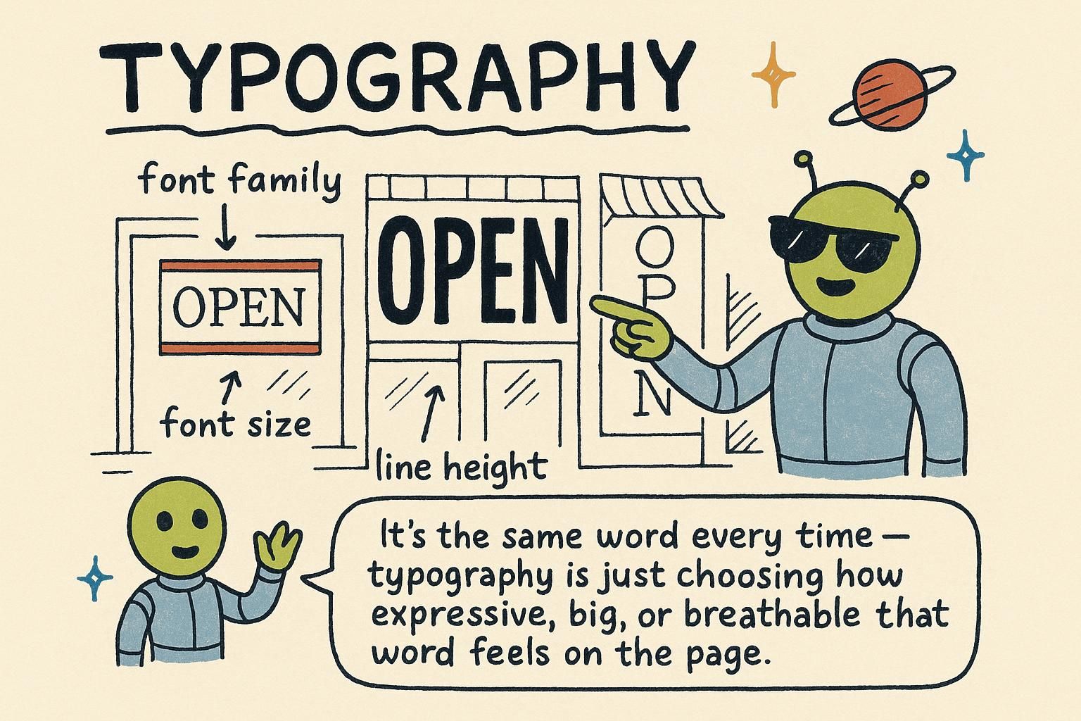
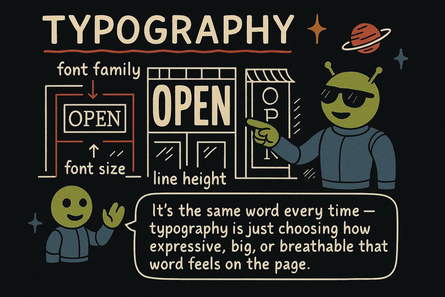
Most of what people read on the web is text, and most of the feeling a page gives off comes from how that text is set. Swap the typeface, nudge the line spacing, cap the line length, and the same paragraph goes from cramped and off-putting to calm and readable. None of that is decoration. It is typography, the handful of CSS properties that decide how comfortable your words are to read, and this chapter is the tour of the ones you reach for daily.

Choosing a typeface

The property that picks your font is font-family, and you give it not one font but a list. This list is the font stack: the browser tries the first font, and if it is not available it falls back to the next one, and so on down the line.

css
body {
  font-family: "Helvetica Neue", Arial, sans-serif;  /* try Helvetica, then Arial, then any sans-serif */
}

The last name should always be a generic family like sans-serif or serif. That is your safety net: if none of the named fonts are on the reader's device, the browser still shows something sensible instead of a default you did not choose. Font names with spaces go in quotes; single-word names do not need them.

font-family takes a comma-separated font stack, and the browser uses the first font in the list that it can actually render. Each name is a fallback for the one before it, and the list should end in a generic family (sans-serif, serif, monospace) so there is always a final answer.

css
body {
  font-family: "Inter", "Helvetica Neue", Arial, sans-serif;
}

You have two broad options for the fonts you name. The system font stack lists the default interface fonts of each operating system, so the page borrows whatever the reader's device already uses. It costs nothing to download and feels native, which is why a lot of apps use it:

css
body {
  font-family: -apple-system, "Segoe UI", Roboto, Helvetica, Arial, sans-serif;
}

The other option is a web font: a font file you load so every reader sees the same typeface. You link one from a host like Google Fonts, or self-host it with @font-face. That gives you control over the look at the cost of a download the reader waits for.

font-family resolves a font stack left to right, picking the first family the browser can render, which is why the list ends in a generic family (sans-serif, serif, monospace) as a guaranteed last resort. Two strategies sit behind the names you choose, and they trade differently.

The system font stack names each platform's native UI font, so the page inherits the typeface the operating system already ships. Nothing downloads, so there is no load delay and no layout shift, and the text looks native on every device. The cost is that your page looks slightly different across platforms, which is fine for app-like interfaces and wrong for a brand that needs one consistent face.

css
body {
  /* the modern system stack: San Francisco, Segoe UI, Roboto, then fallbacks */
  font-family: system-ui, -apple-system, "Segoe UI", Roboto, sans-serif;
}

A web font is a font file the browser downloads so every reader sees the same typeface. You either link it from a host, or self-host it with an @font-face rule that maps a family name to a file. Self-hosting keeps the font on your own origin, which avoids a third-party request and gives you control over caching and the font-display behaviour that governs whether text shows in a fallback while the font loads.

css
@font-face {
  font-family: "Satoshi";
  src: url("/fonts/satoshi.woff2") format("woff2");
  font-weight: 400 700;         /* one variable file covering a weight range */
  font-display: swap;           /* show fallback text immediately, swap when loaded */
}

body {
  font-family: "Satoshi", system-ui, sans-serif;  /* named web font, then a native fallback */
}

The reason the fallback still matters with a web font is that the download can be slow or fail, and font-display: swap renders your fallback family in the meantime. Choosing a fallback with similar metrics to the web font keeps the swap from jolting the layout.

JunoChoosing a typefacefont-family takes a list, not one font, and the browser uses the first one it can find. Always end the list with a generic family like sans-serif so there is a safe fallback. Wrap any font name with spaces in it in quotes.
JunoChoosing a typeface The font stack is a list of fallbacks ending in a generic family, and the browser takes the first font it can render. The system font stack borrows the device's native fonts for free with no download, while a web font loads a file so everyone sees the same face. Pick the system stack for app-like work and a web font when the look has to be consistent.
JunoChoosing a typeface Stacks resolve left to right and must end in a generic family, so the reader always sees text. The system stack costs nothing and never shifts layout but varies by platform; a web font is one consistent face at the cost of a download you should guard with font-display: swap and a well-matched fallback. Self-host with @font-face when you want control over caching and the third-party request gone.

Sizing text

You set text size with font-size. You can give it a value in pixels, but the size you should reach for is the rem, a unit tied to the page's base font size. One rem equals the browser's default text size, which is usually 16px, so 1rem is a normal reading size and 1.25rem is a bit larger.

css
body {
  font-size: 1rem;             /* the base reading size, usually 16px */
}
h1 {
  font-size: 2rem;             /* twice the base size */
}

font-size sets the size of text, and for body copy you should size it in rem rather than px. One rem is the root element's font size, which defaults to 16px and is a value the reader can change in their browser settings. Sizing in rem means your text scales with that preference; sizing in px locks it.

css
:root {
  font-size: 100%;             /* respects the reader's default, usually 16px */
}
p {
  font-size: 1rem;             /* scales if the reader changes their default */
}

Size body text in rem, not px, so it respects the reader's chosen size. The sizing units chapter goes into how rem, em, percentages, and viewport units resolve; the short version for typography is that rem gives you scalable, accessible text with predictable maths.

font-size accepts many units, but for body text the choice comes down to accessibility. A rem (root em) is relative to the font-size of the root element (<html>), whose default is whatever the reader set in their browser, normally 16px but freely changeable. A pixel value ignores that preference. A reader who raises their default text size for comfort or a visual impairment sees rem-sized text grow and px-sized text stay put, so px body copy quietly overrides an accessibility setting the reader deliberately chose.

css
:root {
  /* leave the root at the reader's default; do not hard-set it to 16px in px */
  font-size: 100%;
}

p {
  font-size: 1rem;             /* 1rem = the reader's root size, scales with it */
}

.lead {
  font-size: 1.125rem;         /* 18px at a 16px root, still scales */
}

Prefer rem over em for font-size because em is relative to the parent's font size, so ems compound when they nest: an em-sized element inside another em-sized element multiplies, and a list nested three deep can shrink or grow unexpectedly. rem always refers to the single root value, so it stays predictable however deep the element sits. Note this is distinct from page zoom, which scales everything including px; the case rem protects is the reader raising the default font size specifically, which many people do and which px text ignores.

JunoSizing textfont-size sets how big text is, and rem is the unit to reach for. One rem is the browser's normal text size, so 1rem is regular and 2rem is twice as big. Avoid sizing body text in px, which is what the next levels dig into.
JunoSizing text Size body text in rem, not px. One rem is the reader's root font size, so text in rem scales when they change their default and text in px stays stuck. The sizing units chapter covers the maths, but for type the rule is short: rem for anything a person reads.
JunoSizing textrem tracks the root font size the reader controls, so px body text silently overrides an accessibility choice they made on purpose. Reach for rem over em too, because em is relative to the parent and compounds when elements nest. This is about the reader's default text size, which is a separate thing from page zoom.

Weight and style

Two properties change the shape of your letters. font-weight controls how bold the text is, and font-style turns on italics.

css
strong {
  font-weight: bold;           /* heavier, thicker strokes */
}
em {
  font-style: italic;          /* slanted */
}

bold and normal are the everyday weight keywords. For italics, italic slants the text and normal keeps it upright.

font-weight sets how heavy the text is, and while normal and bold are the familiar keywords, the property really takes numeric weights from 100 to 900 in steps of 100. 400 is what normal maps to, and 700 is what bold maps to. The numbers matter because many fonts ship extra weights that the keywords cannot reach.

css
h1 {
  font-weight: 700;            /* same as bold */
}
.caption {
  font-weight: 300;            /* a light weight, no keyword for it */
}

font-style: italic gives you the font's true italic design where one exists, a separately drawn slanted face rather than a mechanical tilt. Reserve it for real emphasis or conventions like book titles, not for styling large blocks, which italics make harder to read.

font-weight takes numeric weights from 100 to 900; normal is an alias for 400 and bold for 700. The number only resolves to a distinct thickness if the font actually contains that weight. Ask for 600 from a font that ships only 400 and 700, and the browser either rounds to a real weight or synthesises a fake bold by thickening the strokes, which looks worse than the designed weight. So the available weights depend on what you loaded: a web font linked at only two weights gives you two, whatever numbers you write.

css
h1 {
  font-weight: 800;            /* only distinct if the font ships an 800 face */
}
p {
  font-weight: 400;
}

font-style: italic selects the font's drawn italic face, which is a separate design with different letterforms rather than a mechanical slant. Where no italic face exists the browser fakes one by shearing the upright, called synthetic italic, and it reads as cheaper. There is also oblique, a true slant of the upright design, but italic is what you want for prose because it picks the properly drawn face when the font has one.

JunoWeight and stylefont-weight makes text bolder or lighter, and font-style: italic slants it. The keywords bold and normal cover most of what you need day to day. Use italics for emphasis, not for whole paragraphs, which get hard to read.
JunoWeight and stylefont-weight really runs 100 to 900, with 400 as normal and 700 as bold, and the numbers unlock weights the keywords cannot name. Only the weights your font actually ships will show; the rest get faked or rounded. Keep italic for emphasis and titles rather than long stretches of text.
JunoWeight and style Numeric weights run 100 to 900, but a number only lands if the font contains that face; otherwise the browser rounds or synthesises a fake bold that looks worse. So a web font loaded at two weights gives you two, whatever you type. italic picks the drawn italic face when it exists and falls back to a synthetic slant when it does not.

Spacing that makes text readable

Comfortable text is mostly about space. line-height controls the gap between lines, and giving it a bit of room makes a paragraph much easier to read.

css
p {
  line-height: 1.5;            /* one and a half times the font size */
}

Use a plain number like 1.5 with no unit. That means "one and a half times the font size", so the spacing grows in step with the text. Cramped lines are one of the most common reasons a page feels hard to read, and this one value fixes most of it.

Three properties do most of the work of readable text. line-height sets the vertical space between lines, and you should give it a unitless value like 1.5, which means 1.5 times the element's font size. letter-spacing adjusts the gap between characters, useful in small doses for uppercase headings. And the length of a line matters as much as either: very long lines are tiring to read, so you cap the line with max-width.

css
p {
  line-height: 1.5;            /* unitless: scales with the font size */
  max-width: 65ch;             /* cap the measure at about 65 characters */
}
.eyebrow {
  text-transform: uppercase;
  letter-spacing: 0.05em;      /* small tracking so caps do not crowd */
}

That ch unit is the width of the "0" character, so 65ch is roughly 65 characters wide. The comfortable measure, the number of characters per line, sits around 45 to 75, and capping it is one of the highest-impact typography moves you can make.

Readability comes down to three controls: line height, letter spacing, and line length. line-height should be unitless (1.5, not 24px), and the reason is inheritance. A unitless line height is inherited as the factor, so each descendant multiplies it by its own font size and every element gets proportional spacing. A line height with a unit is inherited as the computed length, so a child with a larger font size inherits the parent's fixed line box and its lines overlap.

css
body {
  line-height: 1.5;            /* inherited as a factor: every element scales it */
}

h1 {
  font-size: 2.5rem;
  /* inherits 1.5, computes to 1.5 x 2.5rem; a fixed 24px line height would clip here */
}

.article {
  max-width: 65ch;             /* measure of ~65 characters */
  text-wrap: balance;          /* optional: even out ragged lines on headings */
}

letter-spacing (tracking) is best left at the font's default for body text, where the designer already tuned it; small positive values help all-caps and small-caps runs that would otherwise crowd, and tiny negative values can tighten large display headings. Line length is the measure, the character count per line, and the comfortable band is roughly 45 to 75 characters. Set it with max-width in ch (the advance width of the "0" glyph) so the cap tracks the font, and the effect on reading comfort outweighs almost any font choice.

JunoSpacing that makes text readableline-height sets the space between lines, and a value of around 1.5 makes text much easier to read. Write it as a plain number with no unit so the spacing grows with the text. Cramped lines are a top reason a page feels hard to read, and this fixes most of it.
JunoSpacing that makes text readable Give line-height a unitless value like 1.5 so it scales with each element's font size. Cap line length with max-width in ch to keep the measure around 45 to 75 characters, which is one of the biggest readability wins there is. Use letter-spacing sparingly, mostly to open up uppercase headings.
JunoSpacing that makes text readable Keep line-height unitless so it inherits as a factor and scales per element; a unit inherits the computed length and makes big headings overlap. Leave letter-spacing alone for body text and nudge it only for caps or large display type. Cap the measure near 45 to 75 characters with max-width in ch, and it beats most font decisions for readability.

Aligning and decorating

Three properties handle alignment and finishing touches. text-align moves text left, right, or centre. text-transform changes the case, like making text all uppercase. And text-decoration adds or removes lines such as underlines.

css
h1 {
  text-align: center;          /* centre the heading */
}
.button {
  text-transform: uppercase;   /* show as all caps */
  text-decoration: none;       /* remove the link underline */
}

text-transform: uppercase shows the text in capitals without you retyping it, so the original content stays as normal words. Underlines are added or removed with text-decoration.

text-align positions inline text within its box (left, right, center, justify). text-transform changes case for display (uppercase, lowercase, capitalize) without altering the underlying text, so a screen reader still reads the real words and your HTML stays clean. text-decoration controls underlines, overlines, and strikethroughs.

css
.card-title {
  text-align: center;
}
.nav-link {
  text-decoration: none;              /* strip the default underline */
}
.price--old {
  text-decoration: line-through;      /* struck-through old price */
}

Two habits worth keeping. Avoid text-align: justify for web body text, because without fine hyphenation control it opens ugly rivers of white space between words. And when you remove an underline from a link, make sure another cue like colour still marks it as a link, or you have hidden that it is clickable. The colours and backgrounds chapter covers giving links a distinct, accessible colour.

text-align sets the inline alignment of content within its containing box. Skip justify for web body text: browsers justify by stretching word spacing, and without the hyphenation and line-breaking control print typesetters have, it opens rivers of whitespace and hurts readability more than the tidy edge helps.

text-transform (uppercase, lowercase, capitalize) changes only the rendered case, not the source text, so the accessibility tree and your markup keep the real casing. That is the right way to do all-caps: transform in CSS rather than typing capitals into the HTML, so assistive tech does not read the word letter by letter and the content stays editable as normal prose. Pair uppercasing with a little positive letter-spacing, since caps set at the body's default tracking read tight.

text-decoration is a shorthand for line, style, colour, and thickness (text-decoration: underline wavy crimson 2px), with longhands like text-decoration-color and text-underline-offset for finer control. The common case is text-decoration: none on links, and the rule that comes with it is to keep another visible affordance, since removing the underline strips the main signal that text is a link.

css
.headline {
  text-transform: uppercase;
  letter-spacing: 0.04em;             /* caps need breathing room */
}

a {
  text-decoration-color: currentColor;
  text-underline-offset: 0.15em;      /* nudge the underline off the baseline */
}

text-align, text-transform, and line-height inherit, so setting them on a container flows them to the text inside; the selectors chapter covers targeting the right container to set them on.

JunoAligning and decoratingtext-align moves text left, right, or centre, text-transform: uppercase shows it in capitals, and text-decoration adds or removes lines like underlines. Uppercasing in CSS keeps your actual text as normal words, so you never retype it in caps. Reach for text-decoration: none when you want to drop a link's underline.
JunoAligning and decoratingtext-align places inline text, text-transform changes case for display only, and text-decoration handles underlines and strikethroughs. Skip justify on the web, where it opens ugly gaps between words. If you strip a link's underline, keep another cue like colour so people still see it is clickable.
JunoAligning and decorating Avoid justify for web body text; browsers stretch word spacing and open rivers of whitespace. Do all-caps with text-transform, not by typing capitals, so assistive tech reads real words and the source stays clean, and add a little letter-spacing to caps. When you set text-decoration: none on a link, keep another affordance so it still reads as a link.

The font shorthand and inheritance

Font properties have a handy trait: they pass down. Set font-family on the <body> and every paragraph, heading, and link inside inherits it, so you rarely repeat yourself.

css
body {
  font-family: system-ui, sans-serif;  /* everything inside inherits this */
  line-height: 1.5;
}

Because of this, most of your typography lives in one place near the top of your stylesheet, and individual elements only override what they need to differ on.

Font properties inherit: font-family, font-size, font-weight, font-style, line-height, and colour all pass from an element to its descendants unless overridden. That is why you set the base type on body once and let it flow down, a point the how CSS works chapter covers in depth.

There is also a font shorthand that packs several properties into one declaration, but it comes with a catch worth knowing before you use it.

css
body {
  font: 1rem/1.5 system-ui, sans-serif;   /* size/line-height family */
}

The order is fixed and font-size and font-family are both required. The line-height goes after the size with a slash. Because it is a shorthand, any font property you leave out is reset to its initial value, which can wipe a font-weight you set elsewhere.

Font properties inherit down the tree, so font-family, font-size, font-weight, font-style, and line-height set on a container apply to everything inside until an element overrides them. Setting the base type once on body and overriding selectively is the idiomatic pattern; the how CSS works chapter details how inheritance and the cascade decide the final value.

The font shorthand sets several of these at once, and its gotcha is real: it is a shorthand, so every longhand it can set but you omit is reset to its initial value. Write font: 1rem/1.5 system-ui and any font-weight, font-style, or font-variant set earlier is silently wiped back to normal. The syntax also has a fixed order and two required parts, font-size and font-family, with an optional line-height attached to the size by a slash.

css
.callout {
  font: italic 700 1rem/1.5 system-ui, sans-serif;  /* style weight size/line-height family */
}

Two more advanced notes. Modern variable fonts pack a continuous range of weights (and sometimes width and slant) into one file, so font-weight: 550 can be a real, drawn value rather than a rounded one when the font exposes that axis. And the accessibility rule from the sizing section holds across all of this: keep sizes in rem and line height unitless so the whole type system scales when the reader adjusts their default font size or zooms the page, rather than pinning text to a fixed pixel grid.

JunoThe font shorthand and inheritance Font settings pass down to the elements inside, so set font-family on the body once and everything inherits it. That keeps your typography in one place near the top of the stylesheet. Individual elements only override the bits they need to change.
JunoThe font shorthand and inheritance Font properties inherit, so base type set on body flows down and you override only what differs. The font shorthand packs size, line height, and family together, but watch the catch: anything you leave out is reset to its initial value, which can wipe a weight you set elsewhere. Its order is fixed, with size and family required.
JunoThe font shorthand and inheritance Font properties inherit, so set the base type on body and override selectively. The font shorthand resets every longhand you omit to its initial value, so it can silently erase a weight or style set earlier; reach for it knowing that. Keep sizes in rem and line height unitless so the type scales with the reader's default size and zoom, and lean on variable fonts when you need a continuous weight range from one file.