

 Learn HTML & CSS
Grid
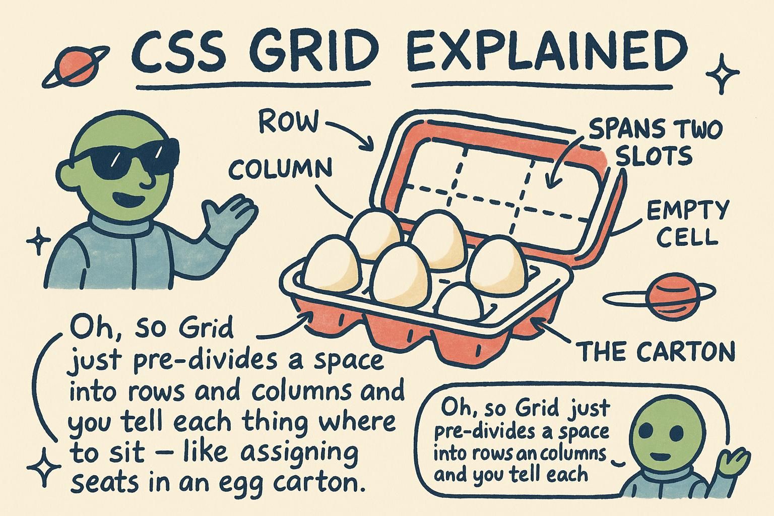
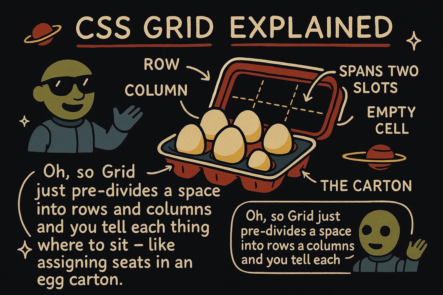
You have a page with a header across the top, a sidebar down the left, a main content area, and a footer. You could nest a stack of containers and nudge each one into place, and it would mostly work until the day you need to change the arrangement. CSS grid was built for exactly this shape of problem: laying out a page in rows and columns at the same time. Once you can describe a layout as a set of tracks, most of the fiddling with wrappers and floats falls away.
The grid container
You turn any element into a grid by giving it display: grid. That element becomes the grid container, and its direct children become items that snap into a grid you define. On its own, display: grid does not do much, so you also tell it how many columns and rows you want and how big each should be.
You describe the columns with grid-template-columns and the rows with grid-template-rows. Each value in the list is one track, and a track is a single column or row:
.layout {
  display: grid;
  grid-template-columns: 200px 1fr;   /* two columns: a fixed one, then the rest */
  grid-template-rows: 80px 400px;     /* two rows: a short one, then a tall one */
}
display: grid to an element and it becomes a grid container, with its direct children sitting inside as items. Then you say how many columns and rows you want with grid-template-columns and grid-template-rows, one value per track. Nothing lines up until you define those tracks, so that is always your first move. Flexible tracks
Fixed pixel columns are fine, but most layouts want columns that share the space evenly and grow with the screen. That is what the fr unit is for. One fr means one share of the leftover space, so three columns of 1fr each take a third of the container:
.gallery {
  display: grid;
  grid-template-columns: 1fr 1fr 1fr;   /* three equal columns */
}
Typing 1fr three times gets tedious, so repeat() writes it for you. And gap sets the space between the tracks, so you do not reach for margins on every item:
.gallery {
  display: grid;
  grid-template-columns: repeat(3, 1fr);   /* the same three equal columns */
  gap: 16px;                               /* space between rows and columns */
}fr is one share of the leftover space, so 1fr 1fr 1fr gives you three equal columns. Use repeat(3, 1fr) so you are not typing the same value over and over, and gap for the space between tracks. Once fr clicked for me, I stopped reaching for percentages that never quite added up. Placing items
By default each item drops into the next free cell, one per cell, in order. When you want an item to take up more than one cell, you say so with grid-column and grid-row. The lines between tracks are numbered starting at 1, so grid-column: 1 / 3 means "start at line 1, end at line 3", covering two columns:
.featured {
  grid-column: 1 / 3;   /* span from column line 1 to line 3, two columns wide */
}
If you do not want to count lines, span says how many cells to cover from wherever the item lands:
.featured {
  grid-column: span 2;   /* cover two columns, starting wherever this item sits */
}grid-column or grid-row. Line numbers start at 1, so grid-column: 1 / 3 covers two columns, or use span 2 if you would rather not count. That is enough to build most layouts before you ever name a single area. Responsive grids without media queries
A row of cards should show three across on a wide screen, two on a tablet, one on a phone. You can do that with grid alone, no breakpoints to write. The trick is one line:
.cards {
  display: grid;
  grid-template-columns: repeat(auto-fit, minmax(200px, 1fr));
  gap: 16px;
}
Read it inside out. minmax(200px, 1fr) means each column is at least 200px and at most one share of the space. auto-fit then fits as many of those columns as the container has room for. Wide screen, more columns fit; narrow screen, fewer fit, and the cards reflow on their own.
repeat(auto-fit, minmax(200px, 1fr)) makes cards reflow on their own, no breakpoints needed. Each column is at least 200px and at most one share of the space, and auto-fit packs in as many as fit. Change the 200px and you change how many cards sit side by side.