
Skip to content

Responsive design

docs.scrimba.com

You build a page on your laptop, it looks right, and then someone opens it on a phone. The columns you carefully lined up are now crushed into a sliver, the text runs off the edge, and a horizontal scrollbar appears where there should be none. Nobody wrote a separate phone version of the site. There is one page, and it has to look right on a 380 pixel phone and a 1400 pixel monitor without you shipping two of everything. That adaptability is responsive design, and most of it is built from tools you already have.

What responsive means and the viewport

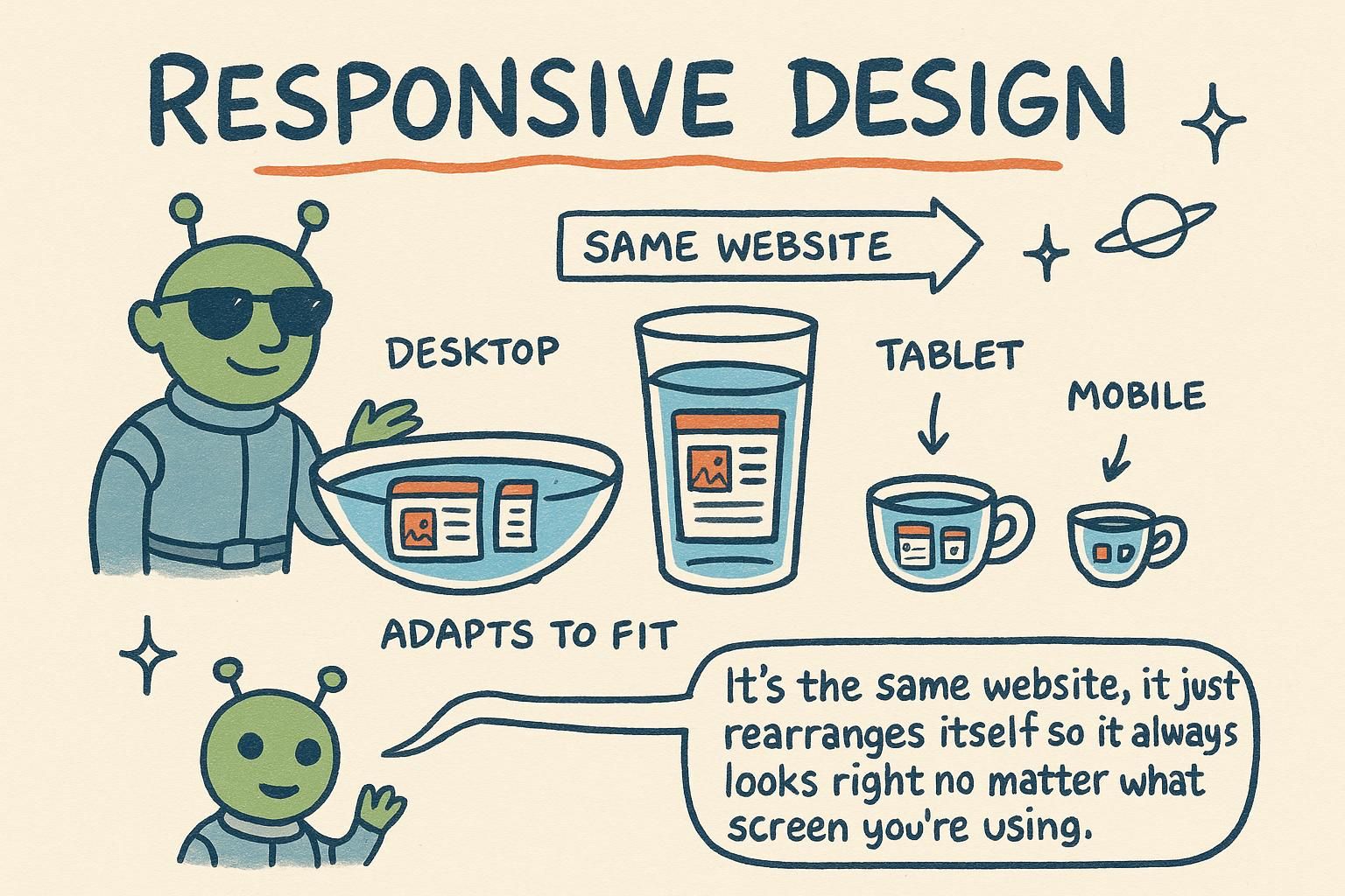
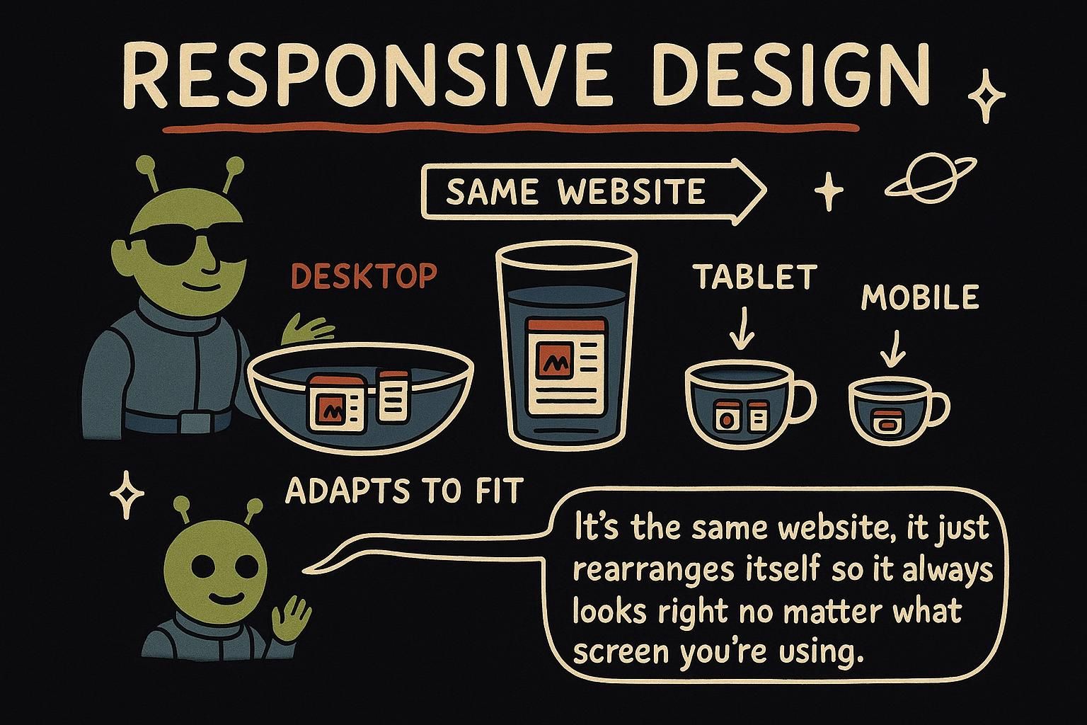
A responsive page is one page that reshapes itself to fit whatever screen it lands on. The same HTML and the same CSS serve a phone, a tablet, and a desktop, and the layout adjusts so nothing overflows and nothing feels cramped. You are not building three sites. You are building one that bends.

Before any of that works, the browser needs one instruction in the HTML. Phones used to pretend they were desktop-width and shrink the whole page to fit, which is why old sites showed up as a tiny, zoomed-out mess. This one line, which lives in the <head> of your HTML, tells the phone to use its real width instead:

html
<meta name="viewport" content="width=device-width, initial-scale=1" />

Without it, your CSS is styling an imaginary wide screen and your careful layout never gets a chance.

Responsive design means a single codebase that adapts its layout to the size of the viewport, the visible area of the page inside the browser window. There is one set of HTML and one stylesheet; what changes is how that stylesheet responds to the space it is given. The alternative, separate mobile and desktop sites, doubles your maintenance and is why the industry settled on responsive years ago.

The starting requirement is the viewport meta tag in the HTML head. It sets the width the browser lays out against to the device's actual width, and stops mobile browsers from rendering at a fake desktop width and scaling down:

html
<meta name="viewport" content="width=device-width, initial-scale=1" />

width=device-width matches the layout viewport to the screen, and initial-scale=1 sets the starting zoom to 100%. Leave this out and no amount of correct CSS will save the layout, because the browser is measuring against the wrong width.

Responsive design is the practice of building one document whose layout adapts to a continuous range of viewport sizes, rather than targeting a handful of fixed screens. The viewport is the region the browser uses to lay out and paint the page, and its width is the value every relative unit, percentage, and media query ultimately resolves against. Get that width wrong and everything downstream is measuring the wrong thing.

That is exactly what the viewport meta tag prevents. Mobile browsers historically distinguished a layout viewport (the width CSS lays out against) from the visual viewport (what is actually on screen), defaulting the layout viewport to around 980px so legacy desktop-only sites would render and then zoom out to fit. The meta tag collapses that gap:

html
<meta name="viewport" content="width=device-width, initial-scale=1" />

width=device-width ties the layout viewport to the device's own CSS-pixel width, and initial-scale=1 pins the initial zoom so the two viewports start aligned. It belongs in the HTML head, and it is a precondition, not a nicety: without it the browser evaluates your media queries and percentages against roughly 980px on a 390px phone, so a min-width: 40rem query fires when it should not and the layout you tested never appears. Everything in this chapter assumes that tag is present.

JunoWhat responsive means and the viewport A responsive page is one page that reshapes itself to fit any screen, phone through desktop, from a single set of HTML and CSS. Before your CSS gets a fair shot, the HTML head needs the viewport meta tag, which tells phones to use their real width instead of pretending to be a desktop. Leave it out and the layout looks broken no matter how good the CSS is.
JunoWhat responsive means and the viewport Responsive means one codebase that adapts to the viewport, the visible page area, not separate mobile and desktop builds. The viewport meta tag in the HTML head is the starting requirement: width=device-width makes the browser lay out against the real screen width. Skip it and your media queries fire against a fake desktop width, so correct CSS still looks wrong.
JunoWhat responsive means and the viewport Every percentage and media query resolves against the viewport width, so the viewport meta tag is a precondition rather than a nicety. width=device-width, initial-scale=1 ties the layout viewport to the device's real width instead of the legacy 980px default. Forget it on a phone and a min-width: 40rem query fires when it should not, and the layout you tested never renders.

Fluid layouts first

The reflex is to reach for special phone rules straight away, but a lot of responsiveness comes for free before you write a single one. If you build with fluid values, ones that stretch and shrink with the space, the layout already adapts.

Two habits carry most of it. Set widths as percentages so a box takes a share of its container rather than a fixed number of pixels, and use max-width so something can shrink on a small screen but never grow past a comfortable reading size on a large one:

css
.container {
  width: 90%;              /* takes 90% of whatever space it has */
  max-width: 60rem;        /* but never wider than 60rem on big screens */
  margin: 0 auto;          /* centred */
}

On a phone this container is 90% of a narrow screen. On a monitor it stops growing at 60rem and sits centred. You did not write a phone rule; the values did the adapting.

Before media queries, build the layout out of fluid values so it flexes on its own. Relative units and percentages let elements take a share of their container instead of a fixed size, and flexbox and grid already reflow their children as space changes. A good fluid layout needs far fewer breakpoints than a rigid one, because it is not fighting the screen in the first place.

Reach for media queries only after the fluid layout stops coping. Percentages and max-width handle width, and one grid pattern handles the common card-wall case without any query at all:

css
.card-grid {
  display: grid;
  gap: 1.5rem;
  /* as many columns as fit at 16rem min, sharing leftover space equally */
  grid-template-columns: repeat(auto-fit, minmax(16rem, 1fr));
}

repeat(auto-fit, minmax(16rem, 1fr)) says "fit as many columns as you can at a minimum of 16rem each, then stretch them to fill the row". Three columns on a wide screen, two on a tablet, one on a phone, and not one media query. Which relative units to prefer for these values is covered in sizing units.

The strongest responsive layouts are mostly fluid before a single media query is written, because a breakpoint is a discrete jump and most of the work is continuous. Percentages, max-width, and the intrinsic sizing built into flexbox and grid let the layout track the viewport smoothly, and media queries then handle only the points where the design really needs to change shape, not every pixel of resizing in between.

The pattern that earns its keep is the self-adjusting grid, because it collapses a whole set of breakpoints into one declaration:

css
.card-grid {
  display: grid;
  gap: 1.5rem;
  grid-template-columns: repeat(auto-fit, minmax(16rem, 1fr));
}

minmax(16rem, 1fr) gives each track a floor of 16rem and a ceiling of one equal share of the free space, and auto-fit creates as many tracks as fit at that floor, then expands them to fill the row. The column count falls out of the container width automatically, so a layout that would have taken three breakpoints takes none. One precision note worth carrying: auto-fit collapses empty tracks so the present items stretch to fill the row, whereas auto-fill keeps the empty tracks reserved, so pick auto-fit when you want items to grow into leftover space and auto-fill when you want a stable grid. See sizing units for how these rem and fr values resolve.

JunoFluid layouts first A lot of responsiveness is free before you write any special rules: use percentages so boxes take a share of their space, and max-width so they shrink on phones without stretching too wide on monitors. Those two values adapt the layout on their own. Build fluid first, and you will need far fewer of the phone-specific rules that come next.
JunoFluid layouts first Build fluid before you build breakpoints: percentages and max-width handle width, and flexbox and grid already reflow on their own. The one grid line to remember is repeat(auto-fit, minmax(16rem, 1fr)), which gives you a responsive card wall with zero media queries. Reach for a query only once the fluid layout really stops coping.
JunoFluid layouts first A breakpoint is a discrete jump, but resizing is continuous, so let percentages, max-width, and intrinsic flex and grid sizing carry the smooth part and save media queries for real shape changes. repeat(auto-fit, minmax(16rem, 1fr)) collapses several breakpoints into one line. Remember that auto-fit collapses empty tracks to stretch your items, while auto-fill keeps them reserved.

Media queries

Sometimes fluid values are not enough and you need the layout to actually change at a certain size, for example a menu that stacks vertically on a phone but sits in a row on a desktop. That is what a media query is for: a block of CSS that only applies when the screen meets a condition you set.

Start with the styles for the small screen as your normal CSS, then add a query that layers on the wider-screen changes:

css
.nav {
  display: flex;
  flex-direction: column;   /* stacked on small screens */
}

@media (min-width: 40rem) {
  .nav {
    flex-direction: row;    /* side by side once there is room */
  }
}

The rule inside @media (min-width: 40rem) only switches on once the screen is at least 40rem wide. Below that, the plain .nav rule applies and the menu stacks.

A media query wraps a set of rules in a condition, most often a width test, and those rules apply only when the condition holds. The pattern to adopt is mobile-first: write your base styles for the smallest screen with no query at all, then layer enhancements upward with min-width.

css
.layout {
  display: grid;
  gap: 1rem;
  grid-template-columns: 1fr;      /* base: single column, small screens */
}

@media (min-width: 40rem) {
  .layout {
    grid-template-columns: 1fr 1fr; /* two columns once there is room */
  }
}

Mobile-first matters for more than tidiness. Your base styles are the ones that always apply, so making them the simplest, most reliable layout means the smallest and most constrained devices get the safest experience by default, and each query only ever adds capability. Building the other way, desktop-first with max-width queries that strip things away, tends to leave the mobile view as an afterthought that breaks.

A media query applies a block of rules only when a media condition evaluates true, and for responsive layout that condition is almost always a viewport width test. The discipline that holds up is mobile-first: unconditional base styles describe the narrow layout, and every min-width query is purely additive on top of them.

css
.layout {
  display: grid;
  gap: 1rem;
  grid-template-columns: 1fr;       /* base, applies everywhere */
}

@media (min-width: 40rem) {         /* tablet and up */
  .layout { grid-template-columns: 1fr 1fr; }
}

@media (min-width: 64rem) {         /* desktop and up */
  .layout { grid-template-columns: 1fr 2fr 1fr; }
}

The reason to prefer additive min-width over subtractive max-width is the cascade. Because these queries share specificity, later-fired ones override earlier ones, so ordering them small to large means each wider breakpoint cleanly wins where it applies. Two precisions worth holding: prefer rem over px in the condition so the breakpoint tracks the user's font size, and know that width queries read the layout viewport, which is only correct because the viewport meta tag pinned it to device width. A stray max-width query in the middle of a min-width stack is the usual cause of a rule that mysteriously stops applying, because it is fighting the ordering rather than extending it.

JunoMedia queries A media query is a block of CSS that only switches on when the screen meets a condition, like being at least 40rem wide. Write your small-screen styles as normal CSS first, then use @media (min-width: ...) to add the changes for bigger screens. That way the phone view is your starting point, not a patch bolted on afterwards.
JunoMedia queries Media queries apply rules only when a condition, usually a width, holds true. Go mobile-first: base styles with no query for the smallest screen, then layer up with min-width so every query only adds. Build it the other way with max-width and the mobile view tends to end up the broken afterthought.
JunoMedia queries Mobile-first means unconditional base styles for the narrow layout and additive min-width queries stacked small to large, so the cascade resolves each breakpoint cleanly. Use rem in the condition so it tracks the user's font size, and remember width queries read the layout viewport the meta tag pinned. A lone max-width in a min-width stack is the classic reason a rule quietly stops applying.

Choosing breakpoints

A breakpoint is the width where a media query kicks in and the layout changes. The tempting way to choose one is to look up the width of a popular phone or tablet and match it. That is the trap. There are hundreds of device sizes, they change every year, and chasing them is a game you cannot win.

The better question is: at what width does this layout start to look bad? Widen your browser slowly and watch. When a line of text gets too long to read comfortably, or two columns get too narrow, that is where a breakpoint belongs, whatever number it happens to be.

css
/* Breakpoint chosen because the text got too wide here, */
/* not because a phone happens to be this size */
@media (min-width: 45rem) {
  .article { max-width: 38rem; }
}

A breakpoint is the viewport width at which you change the layout. Pick them by watching your own content, not by matching device names. Round numbers like "768px because that is an iPad" feel authoritative and are a trap: the device landscape shifts constantly, and a layout tuned to last year's popular sizes breaks on this year's.

Let the content decide. Resize the window and add a breakpoint at the width where the design actually strains, a line getting too long, a card getting too cramped, a nav running out of room. You will usually need only two or three across a whole site:

css
/* Content-driven: this line hit ~75 characters and got hard to read */
@media (min-width: 42rem) {
  .prose { max-width: 65ch; }   /* cap the measure once there is room */
}

/* Content-driven: the sidebar layout only earns its space here */
@media (min-width: 60rem) {
  .page { grid-template-columns: 16rem 1fr; }
}

A breakpoint is where the design changes shape, and the durable way to choose one is to let the content set it rather than a device spec sheet. Matching named device widths is fragile for a structural reason: the population of screen sizes is large and drifts every year, so any layout keyed to specific device dimensions is keyed to a moving target and rots on schedule. A breakpoint justified by the content, "the measure passed a readable line length here", stays justified regardless of what hardware ships next.

In practice that means resizing until the layout strains and placing a breakpoint there, and it means most sites need only a small handful:

css
/* Cap the measure where lines cross a readable length, ~65 characters */
@media (min-width: 42rem) {
  .prose { max-width: 65ch; }
}

/* Introduce the sidebar only where the main column can spare the width */
@media (min-width: 60rem) {
  .page { grid-template-columns: 16rem 1fr; }
}

The advanced move is to lean on clamp() for fluid type and spacing so you need fewer breakpoints at all. clamp(min, preferred, max) picks a value that scales with the viewport but is bounded at both ends, so headings and gaps grow smoothly instead of jumping at each query:

css
h1 {
  /* never below 1.75rem, never above 3rem, fluid in between */
  font-size: clamp(1.75rem, 4vw + 1rem, 3rem);
}

That covers most typographic scaling with no breakpoint at all; see sizing units for how the vw term resolves and typography for the type-scale side. Three related tools round this out. Container queries style a component by the width of its own container rather than the viewport, so a card can react to the column it sits in instead of the whole page, which is the component-based counterpart to viewport-based media queries. The prefers-reduced-motion query lets you cut animation for readers who ask their system to reduce it, and prefers-color-scheme lets you honour a system light or dark preference, both written as media queries:

css
@media (prefers-reduced-motion: reduce) {
  * { animation: none; transition: none; }  /* respect the OS setting */
}

@media (prefers-color-scheme: dark) {
  body { background: #111; color: #eee; }
}

For images specifically, responsiveness moves into the HTML: the srcset attribute lets the browser choose an appropriately sized file per screen, which the HTML responsive images chapter covers rather than CSS.

JunoChoosing breakpoints A breakpoint is the width where your layout changes, and the trap is choosing it to match a specific phone or tablet. There are too many device sizes to chase, and they change every year. Widen your browser slowly and add a breakpoint where the layout actually starts to look bad, whatever number that turns out to be.
JunoChoosing breakpoints Let the content pick your breakpoints, not device names: a line getting too long or a card getting too cramped is the real signal, and round device widths like 768px are a moving target that rots. Resize until the design strains, and put the breakpoint there. Most sites need only two or three across the whole thing.
JunoChoosing breakpoints Content-driven breakpoints survive because the screen population drifts every year, so anything keyed to device dimensions rots on schedule. Lean on clamp() for fluid type and spacing to need fewer breakpoints at all, keep container queries in mind for component-level rather than viewport-level styling, and honour prefers-reduced-motion and prefers-color-scheme. For images, the responsiveness lives in HTML srcset, not CSS.