

 Learn HTML & CSS
Organising and scaling CSS
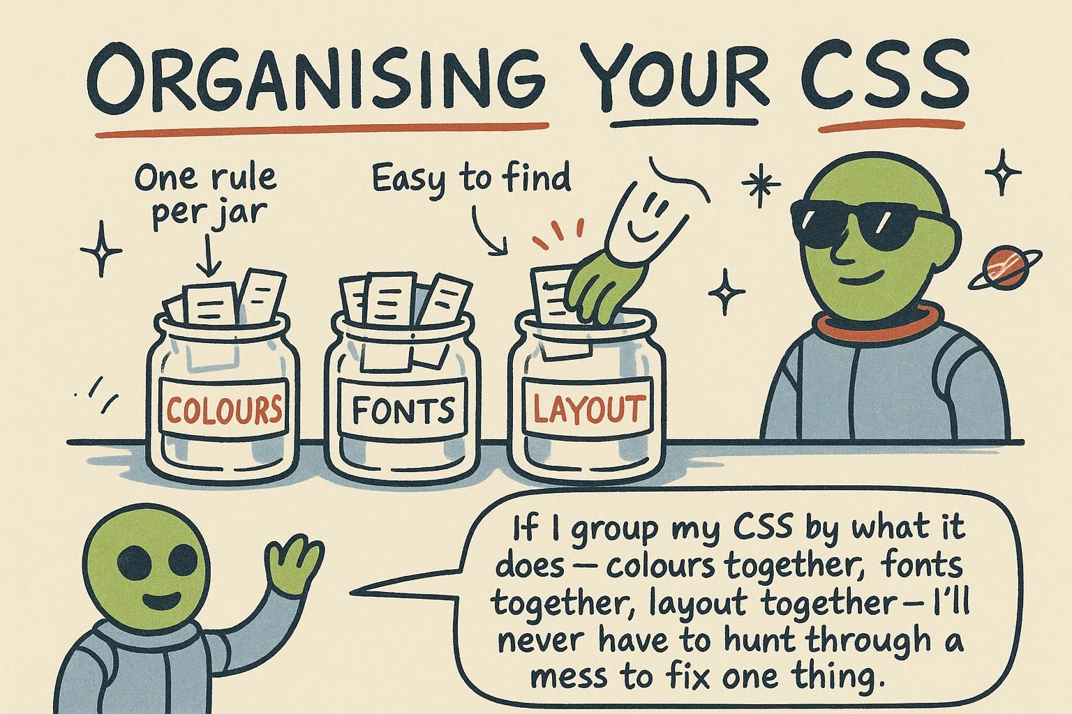
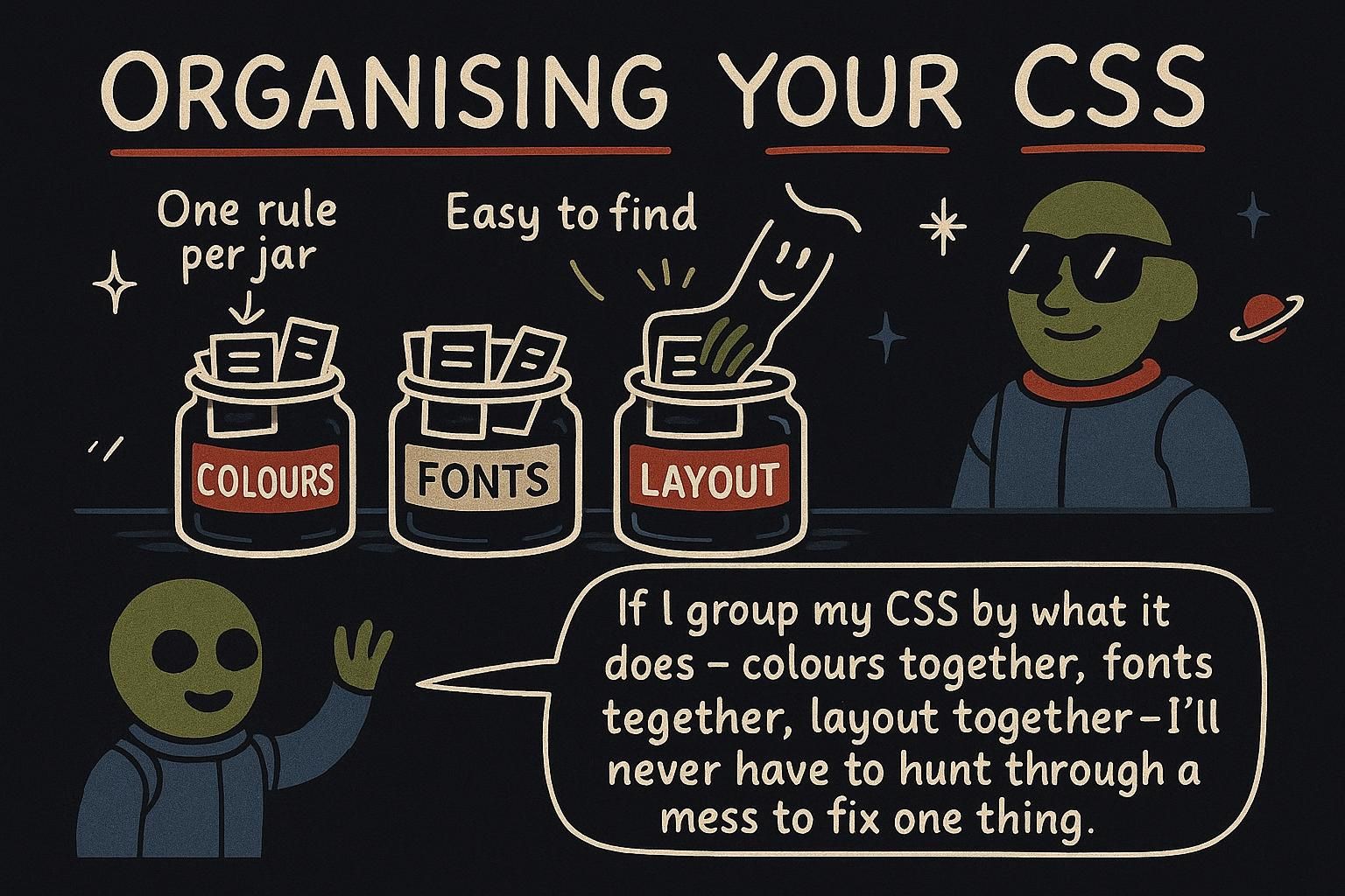
The first stylesheet on a new project is a pleasure to write. A few hundred lines in, something shifts: you change the colour of one button and three other buttons change too, a heading refuses to move until you paste !important next to it, and every new rule feels like it might break an old one. The CSS itself is still correct. What has run out is the structure holding it together, and that structure, not the syntax, is what decides whether a stylesheet stays workable at a thousand lines or a hundred thousand.
Why CSS gets hard to scale
CSS is global by default. Every rule you write can reach any matching element anywhere on the page. Write p { color: navy; } and every paragraph in the whole project turns navy, whether you meant them all or not. On a small page that is convenient. As the project grows, it is the root of most of the trouble.
The problem shows up as rules colliding. Two stylesheets both target p, or a general rule and a specific one both apply to the same element, and now you have to work out which one wins. You saw the machinery that decides this in how CSS works: the browser resolves conflicts by specificity and order. Scaling CSS well is mostly about not creating those conflicts in the first place.
/* One global rule reaching every paragraph on the page */
p {
  color: navy;
}

/* A second rule, elsewhere, competing for the same elements */
.notice p {
  color: crimson;   /* wins inside .notice: more specific */
}
Keep specificity low and flat
The single most useful habit is to style with classes, and mostly one class at a time. A class like .card is quick to apply, reusable, and painless to override later if you need to, because a single class is a low, gentle level of specificity.
The trouble comes from two things: ids and long chains of selectors. An id like #header is much harder to override than a class, and a chain like .sidebar ul li a is tied to one exact structure. Prefer a plain class you can put wherever you want:
/* Prefer: a single class, low and flat */
.nav-link {
  color: navy;
}

/* Avoid: an id, hard to override later */
#nav-link {
  color: navy;
}

/* Avoid: a deep chain, brittle and higher specificity */
.sidebar nav ul li a {
  color: navy;
}.card or .nav-link. A single class is quick to reuse and painless to override later, which is exactly what you want. Steer clear of ids like #header and long chains like .sidebar ul li a, because both are much harder to change. A naming convention
Once you are styling with classes, the next question is what to call them. Names like .blue or .thing2 fall apart fast, because they say nothing about what the class is for. A naming convention is an agreed way to name classes so that the name tells you what a class does and where it belongs.
The widely used one is called BEM, which stands for Block, Element, Modifier. A block is a component like a card. An element is a part inside it, written with two underscores. A modifier is a variation, written with two dashes:
/* Block: the component itself */
.card { }

/* Element: a part of the block, two underscores */
.card__title { }
.card__body { }

/* Modifier: a variant of the block, two dashes */
.card--featured { }<article class="card card--featured">
<h2 class="card__title">Weekend workshop</h2>
<p class="card__body">A short intro to layout.</p>
</article>.card, an element inside it like .card__title with two underscores, and a variant like .card--featured with two dashes. You do not have to use BEM, but pick some consistent scheme and stick to it. Structuring the files
As a stylesheet grows, one long file becomes hard to move around in. The common fix is to split CSS into a few folders by what the rules do: base styles (the defaults for plain elements like body and headings), components (the cards, buttons, and other pieces), and utilities (tiny single-purpose helpers like a spacing or text-alignment class).
One detail matters when you split files: the order you load them in. When two rules have the same specificity, the one that comes later wins, so a stylesheet loaded later can override an earlier one. Load your files from most general to most specific:
/* main.css: order runs least to most specific */
@import "base/reset.css";        /* element defaults */
@import "base/typography.css";

@import "components/card.css";    /* self-contained pieces */
@import "components/button.css";

@import "utilities/spacing.css";  /* loaded last so they can override */
@import "utilities/text.css";Making the cascade explicit
Everything so far keeps the cascade manageable by convention: low specificity, good names, careful file order. There is more here as you go deeper, and it is worth knowing the direction of travel. Modern CSS lets you take control of ordering directly instead of relying on where a file happens to sit, and it gives you ways to keep the cascade predictable as more people work on the same stylesheet. You will meet these tools as your projects grow, and the habits above are what prepare you for them.