

 Learn HTML & CSS
Sizing and units
You set a font size in pixels, ship the page, and a reader who has bumped their browser text up for comfort sees no change at all. You give a card a fixed width and it overflows on a phone. Both come down to the same question: when you type a number in CSS, what is that number measured against? Some units are fixed, some scale to a font, some scale to the parent, and some scale to the screen. Once you know which is which, you stop guessing and start picking the unit that does the job.
Absolute vs relative units
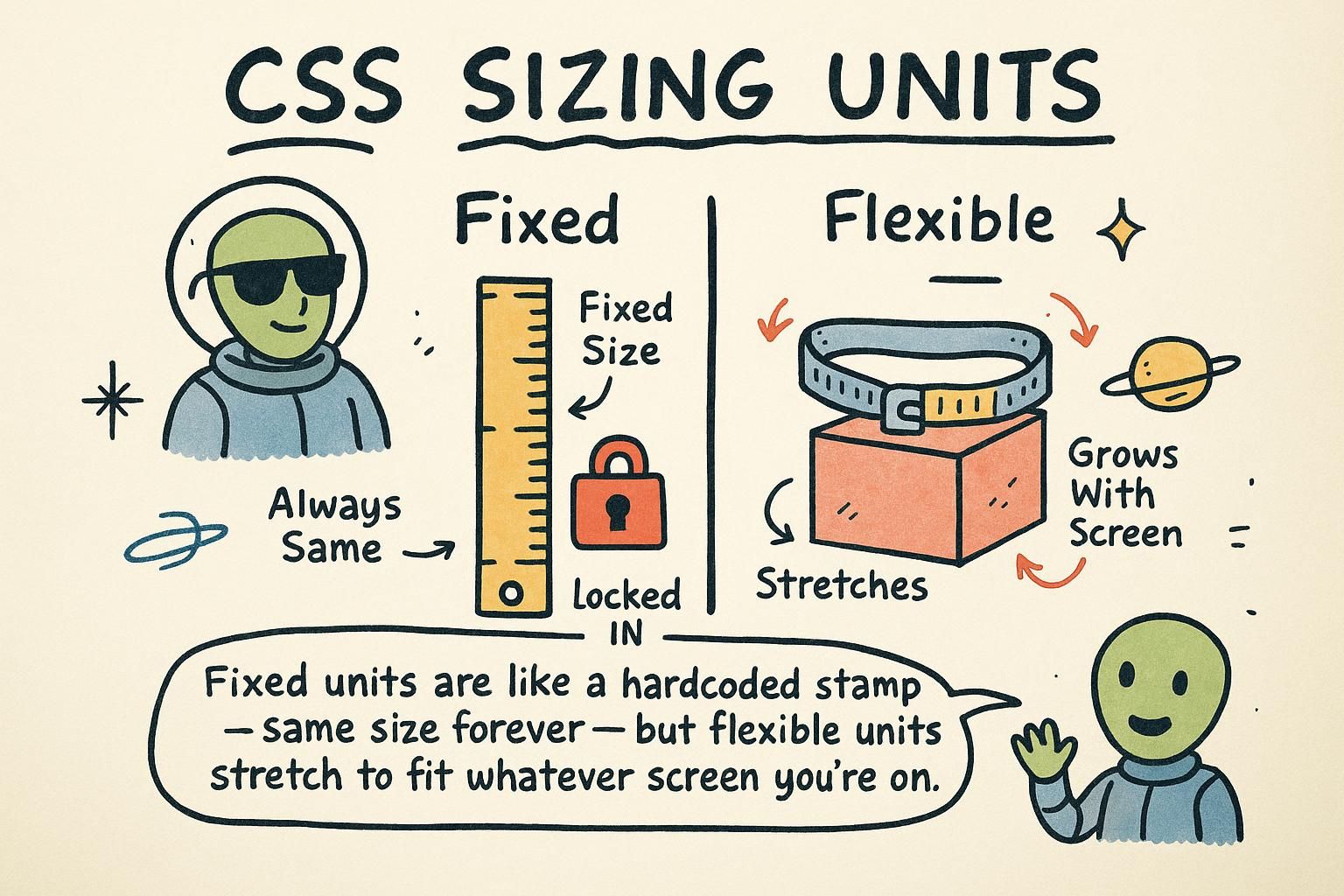
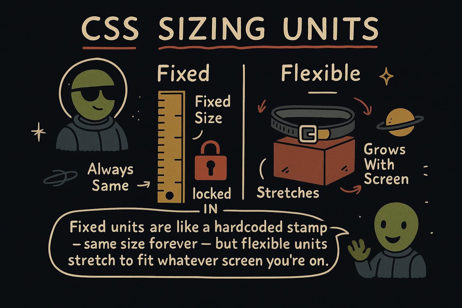
CSS units split into two families. An absolute unit is a fixed size that never changes: px (a pixel) is the one you will meet everywhere. A relative unit is a size that scales to something else, like the reader's font size or the width of the screen.
Think of measuring a room. Centimetres are absolute: a wall is 400cm whether you are tall or short. "Three of my paces" is relative: it depends on whose feet are walking. Absolute units give you exact control; relative units let the page adapt to the person looking at it.
That adapting matters. Some readers set a larger default text size because it is easier on their eyes. If you size your text in a relative unit, their setting carries through and the page grows to suit them. If you lock it in pixels, it stays put and ignores them.

px are a fixed size that never changes. Relative units scale to something else, like the reader's font size or the screen width. Relative units let the page adapt to the person looking at it, which is why they matter for readers who set a larger text size. Pixels and when they are fine
A pixel (px) is a small fixed unit of length. It is the most direct one to reason about, because 16px is always 16px. That makes it a good fit for small things that should stay the same size no matter what: the thickness of a border, a tiny rounded corner, a fixed icon.
.card {
  border: 1px solid #ccc;      /* a hairline border, always 1px */
  border-radius: 8px;          /* a fixed rounded corner */
}
The catch is that a pixel does not care about the reader. If someone has set their browser to show larger text, a heading you locked to 24px stays at 24px and ignores their choice. That is why px is a fine choice for borders and small details, but not the unit you want for text.
px) is a fixed size, so 16px is always 16px. That makes it a good fit for small things that should stay put, like a 1px border or a small rounded corner. The trade-off is that px ignores a reader who has set larger text, so it is not the unit you want for the words on the page. em and rem
Two relative units scale to a font size: em and rem. The one to reach for is rem. It measures against the page's root font size, which is the base text size set on the whole document (16px by default). So 1rem is 16px, 1.5rem is 24px, and 2rem is 32px.
h1 {
  font-size: 2rem;             /* 2 x 16px = 32px */
}
p {
  font-size: 1rem;             /* 16px, the base size */
  margin-bottom: 1.5rem;       /* 24px of space below */
}
Because rem is tied to that one root size, it is predictable: 1.5rem means the same thing everywhere on the page. And when a reader raises their default text size, everything sized in rem grows together. The other unit, em, scales to the element's own font size instead, which can get tangled, so start with rem and you will rarely be caught out.
rem and em both scale to a font size, and the one to start with is rem. It measures against the page's root size, which is 16px by default, so 1.5rem is 24px and means the same thing everywhere. em scales to the element's own font size instead, which can get tangled, so reach for rem first. Percentages
A percentage (%) sizes an element against its parent. For width, width: 50% means half the width of the box the element sits inside, whatever that width happens to be.
.sidebar {
  width: 25%;                  /* a quarter of the parent's width */
}
.content {
  width: 75%;                  /* the remaining three quarters */
}
This is what makes a layout fluid: because the widths are fractions of the parent, they shrink and grow as the parent does. Resize the window and a 50% column stays half the width instead of spilling over the edge the way a fixed 500px column would. That flexibility is why percentages show up so often in responsive design.
width: 50% is half the width of the box the element sits in. That makes columns fluid: resize the window and they grow and shrink instead of spilling over. It is one of the main tools behind layouts that fit any screen. Viewport units
Viewport units size against the browser window itself. vw is a percentage of the viewport width and vh is a percentage of the viewport height, where the viewport is the visible area of the page. So 100vw is the full width of the window and 100vh is its full height.
.hero {
  height: 100vh;               /* fills the whole screen height */
}
This is the go-to for a full-screen section, like a landing banner that should fill the window whatever size it is. Because the units track the window, the section stays full-screen when someone resizes or rotates their device, without you setting a fixed pixel height that would only be right on one screen.
vw and vh size against the browser window: 100vw is its full width and 100vh is its full height. They are the go-to for a full-screen section like a landing banner, because it stays full-screen when the window resizes instead of being locked to one pixel height.