
Skip to content

Display and normal flow

docs.scrimba.com

Drop three paragraphs and a couple of links into a page with no CSS at all, and they still lay themselves out: the paragraphs stack down the page, the links sit inside the text where you wrote them. Nobody told the browser to do that. Before you write a single layout rule, there is already a layout, and every technique you reach for later is a change to it rather than a start from nothing. This chapter is about that starting point and the one property that governs it.

Normal flow

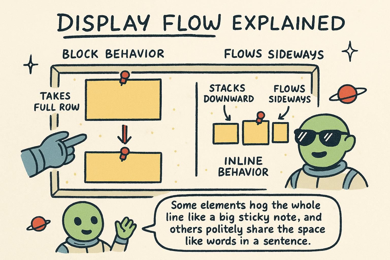
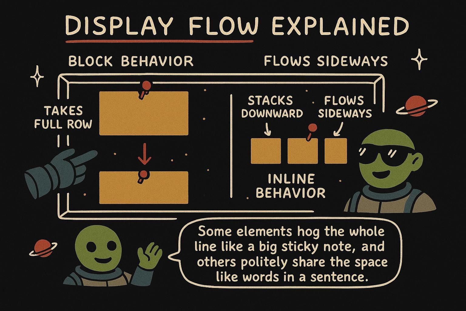
When a browser lays out a page with no layout CSS of your own, it uses normal flow: the default way elements arrange themselves. Block things like paragraphs and headings stack from the top down, each on its own line. Text and links run along inside a line, left to right, wrapping to the next line when they run out of room.

You have already met the pieces that flow around: this chapter builds on the box model, because it is those boxes that flow. Normal flow is worth naming because everything else in layout is defined against it. Flexbox, grid, and positioning are all ways of saying "arrange these differently from the default", so knowing the default is what makes the changes make sense.

Normal flow is the browser's default layout: the arrangement you get before any flex, grid, float, or positioning enters the picture. Block boxes stack vertically down the page in source order, each starting on a new line and taking the full width available. Inline boxes flow along the line, left to right in a left-to-right language, wrapping to the next line when the current one fills.

The reason to name it is that layout tools are defined as departures from it. When you set display: flex on a container, you are telling the browser to lay out that container's children by flex rules instead of normal flow. The default never disappears; you opt individual containers out of it. That is also why an unstyled document is still readable: normal flow is a real layout, not the absence of one.

Normal flow is the layout mode the browser applies by default, before floats, positioning, flex, or grid change anything. It has two sub-modes working together: block layout, which stacks block-level boxes vertically in source order down the page, and inline layout, which arranges inline-level boxes horizontally within a line and wraps them across line boxes. A block box laid out in normal flow takes the full available width and starts on a new line; an inline box takes only as much width as its content and sits within the current line.

Naming it precisely matters because the whole layout system is built as a set of alternatives to it. display: flex and display: grid replace the inner layout of a container with flex or grid rules, and position: absolute or a float pulls a box out of normal flow entirely so surrounding content lays out as if it were not there. In every case normal flow is the baseline you are diverging from, and a box that is not explicitly taken out of it or handed to another layout mode is still flowing. This is why a stylesheet-free document renders in a sensible order at all: block-and-inline flow is the default, not a fallback.

JunoNormal flow Normal flow is the layout you get for free: blocks stack down the page, text and links run along the line. Nobody switches it on, it is already there before you write any CSS. Everything else in layout is a change to this default, so it helps to picture the default first.
JunoNormal flow Normal flow is the browser's default: blocks stack top to bottom in source order, inline boxes run along the line and wrap. Flex, grid, and positioning are all ways of opting a container out of it, never a replacement for it everywhere at once. An unstyled page reads fine because normal flow is a real layout, not the lack of one.
JunoNormal flow Normal flow is block layout stacking vertically plus inline layout running along the line, applied by default before anything else touches the box. display: flex and display: grid swap out a container's inner layout, and float or position: absolute pull a box out of flow so siblings ignore it. Whatever you do not divert stays in flow, which is why a stylesheet-free document still renders in order.

Block boxes and inline boxes

Elements come in two main flavours in normal flow. A block box takes up the whole width of its container and stacks on its own line, pushing the next element below it. A paragraph <p>, a heading <h1>, and a <div> are all blocks, which is why they line up one under another.

An inline box is different. It sits inside a line of text and takes only as much room as its content needs, so several can share a line. A <span> or a link <a> is inline, which is why a link inside a sentence stays in the flow of the words rather than jumping to its own line.

html
<p>This paragraph is a block, so it sits on its own line.</p>
<p>Read the <a href="/css/box-model">box model</a> for more.</p>
<!-- the link is inline, so it stays inside the sentence -->

Every box in normal flow is laid out as either block-level or inline-level, and the two follow different rules. A block box starts on a new line, fills the available width by default, and stacks vertically. <div>, <p>, <h1>, and <section> are block by default. An inline box flows within a line alongside text, takes only the width of its content, and sits next to its neighbours until the line wraps. <span>, <a>, and <strong> are inline by default.

The difference that catches people is what inline boxes ignore. An inline box ignores width, height, and top and bottom margins. Set width: 200px on a <span> and nothing happens, because an inline box is sized by its content, not by you. Left and right padding and margin do apply, but vertical spacing does not push the surrounding lines apart the way it would on a block.

css
.tag {
  width: 200px;        /* ignored: a span is inline, sized by content */
  padding: 0 8px;      /* horizontal padding works */
  margin-top: 40px;    /* ignored: no vertical margin on inline boxes */
}

In normal flow a box is laid out by block layout or inline layout depending on its display type, and the two differ in ways that go past "stacks or wraps". A block box generates a break before and after itself, consumes the full inline size of its containing block unless given a width, and honours all four margins and both dimensions. An inline box takes part in a line box, is sized by its content, and its layout is governed by line-height and baseline alignment rather than by width and height.

The precise part is which properties an inline box drops. width and height do not apply to a non-replaced inline box such as a <span> or <a>, because its size comes from its content and the surrounding line. Top and bottom margins are computed but have no effect on line height, so they never push adjacent lines apart, and top and bottom padding renders visually but does not change the line box's height either, so it can overlap neighbouring lines. Left and right margin and padding do apply and do shift inline neighbours. Replaced inline elements such as <img> are the exception: they carry intrinsic dimensions, so width and height do apply to them even though they are inline-level.

css
.badge {              /* .badge is a <span>, inline by default */
  width: 120px;       /* no effect: width does not apply to inline boxes */
  height: 40px;       /* no effect for the same reason */
  padding: 12px;      /* left/right shift neighbours; top/bottom can overlap lines */
  margin: 8px 0;      /* the vertical 8px is ignored, the horizontal 0 would apply */
}
JunoBlock boxes and inline boxes Block boxes like <p> and <div> take the full width and stack on their own lines. Inline boxes like <span> and <a> sit inside a line and take only the room they need. That is why a link stays inside your sentence instead of breaking onto its own row.
JunoBlock boxes and inline boxes Block boxes fill the width and stack; inline boxes flow along the line and size to their content. The trap is that an inline box ignores width, height, and vertical margins, so setting width on a <span> does nothing. Horizontal padding and margin still work, which is why that catches people out.
JunoBlock boxes and inline boxes An inline box is sized by its content and its line box, so width and height do not apply, and vertical margin and padding do not push adjacent lines apart. Horizontal margin and padding do apply and shift neighbours. The exception is replaced elements like <img>, which carry their own dimensions and so accept width and height even when inline.

The display property

Every element has a default kind, block or inline, but you are not stuck with it. The display property lets you change which one an element behaves like. Set display: block on a link and it now takes its own line; set display: inline on a list item and it sits in a row.

There is a third value that solves a common problem: display: inline-block. It flows in the line like an inline box, but it accepts a width, a height, and vertical padding like a block. That is what you want for something like a button or a nav pill that should sit next to its neighbours yet still take a set size.

css
.nav-link {
  display: inline-block;   /* flows in the line, but accepts width and padding */
  padding: 8px 16px;       /* vertical padding now works, unlike plain inline */
}

The display property sets how a box lays out, and the three flow values are block, inline, and inline-block. display: block makes a box start on its own line and fill the width, whatever the element's default. display: inline makes it flow within a line and drop width, height, and vertical margins. Neither changes the element's meaning, only its layout.

inline-block is the useful hybrid: the box flows in the line like an inline box, so several sit side by side, but it accepts width, height, and vertical padding and margin like a block. Reach for it when you want things in a row that still need real dimensions, a set of buttons or nav links, without moving to flexbox. When you need to lay out a whole row or grid of items with alignment and spacing, display: flex in flexbox is the better tool; inline-block is for the smaller case of a few sized boxes in a line.

css
.stat {
  display: inline-block;   /* sits in a row with its siblings */
  width: 120px;            /* but takes a fixed width, which inline would ignore */
  padding: 12px;           /* full padding applies, top and bottom included */
}

display selects the layout mode for a box, and the three values that keep it in normal flow are block, inline, and inline-block. block gives a box that breaks before and after and fills its containing block's inline size; inline gives a box that joins a line box and drops width, height, and vertical margins. Setting display never touches semantics, only layout: a <div> set to display: inline is still a <div> to the DOM and assistive tech, it only lays out inline.

inline-block is the deliberate hybrid. The box is inline-level, so it takes part in a line box and sits alongside inline neighbours, but its inside is laid out as a block, so width, height, and all four margins and paddings apply and take real layout space. That makes it right for a small number of sized boxes on a line where you do not want a flex container, for example fixed-width stat blocks or nav pills. The caveat is that because it is inline-level, the whitespace between two inline-block elements in your HTML renders as a real space between them, which the advanced section below covers. For anything with alignment, distribution, or wrapping across a full row, prefer the flex layout in flexbox; inline-block is the narrow tool, not the general one.

css
.pill {
  display: inline-block;   /* inline-level box, block-level insides */
  width: 96px;             /* applies, because the inside lays out as a block */
  padding: 10px 14px;      /* all four sides take layout space */
  margin: 0 4px;           /* vertical margin now applies too */
}
JunoThe display property The display property changes whether an element behaves as a block or as an inline box. block takes its own line, inline sits in the text line. The handy middle option is inline-block, which flows in the line yet still accepts a width and padding, so it is what you want for buttons and nav links.
JunoThe display propertydisplay sets the layout, not the meaning: block, inline, or the hybrid inline-block. Use inline-block when you want a few sized boxes sitting in a row, since it flows inline but accepts width, height, and full padding. For a whole row that needs alignment and spacing, reach for flexbox instead.
JunoThe display propertydisplay picks the layout mode and never the semantics, so an inline <div> is still a <div> to the DOM. inline-block is an inline-level box with block-level insides, so it sits in a line but honours width, height, and all four margins. Keep it for a handful of sized boxes and hand a real row to flexbox, and mind the whitespace gap it leaves between adjacent boxes.

Hiding things: display none versus visibility hidden

Sometimes you need an element to not show. There are two ways, and they behave differently. display: none removes the element completely: it disappears and leaves no gap, as if it were not in the page at all. visibility: hidden makes it invisible but keeps its space, so there is an empty hole where it used to be.

Which one you want depends on whether you want the space back. Use display: none to drop something out entirely, like a menu that is closed. Use visibility: hidden when you want to hide something without the layout jumping, because its box stays reserved.

css
.closed-menu {
  display: none;          /* gone, and no gap left behind */
}
.placeholder {
  visibility: hidden;     /* invisible, but still takes up its space */
}

The two ways to hide an element are not interchangeable. display: none takes the element out of normal flow entirely: it generates no box, occupies no space, and the elements around it close up as though it were never there. visibility: hidden keeps the box in flow and reserves its space, so the layout does not shift; the element is only painted invisible.

There is an accessibility difference that matters as much as the visual one. An element with display: none is removed from the accessibility tree too, so screen readers skip it, which is correct for content that is not present at all, like a collapsed panel. visibility: hidden also hides content from screen readers while keeping the space. If you want something visually gone but still announced to assistive tech, neither of these is right; that is what a visually-hidden utility class is for, which you can read about alongside the semantics in how CSS works.

css
.tab-panel[hidden] {
  display: none;          /* removed from flow and from the accessibility tree */
}
.spacer {
  visibility: hidden;     /* keeps its space, still hidden from screen readers */
}

display: none and visibility: hidden both hide, but they differ in flow, in the box tree, and in accessibility. display: none generates no box at all: the element is absent from layout, takes no space, and its descendants are gone with it regardless of their own display. visibility: hidden generates the box normally, so it occupies its full space in flow and only suppresses painting; a descendant can even set visibility: visible to reappear inside an otherwise hidden ancestor, which display: none never allows.

The accessibility and behavioural consequences are the reason to choose deliberately. Both display: none and visibility: hidden remove the element from the accessibility tree, so a screen reader will not announce either. That makes them wrong for content you want visually gone but still read aloud, the classic case being a "skip to content" link or a screen-reader-only label; those need a visually-hidden pattern that clips the box to a pixel while leaving it in the accessibility tree, not either property here. Two further practical notes: display: none cannot be transitioned or animated between states the way opacity and visibility can, and an element set to display: none is not focusable and its form controls are not submitted, whereas a visibility: hidden control is also skipped but its space is held. Pick display: none to remove entirely, visibility: hidden to hide while holding the layout still, and a clipping utility when assistive tech must still reach it.

css
.dropdown[aria-expanded="false"] .menu {
  display: none;          /* fully removed: no box, no space, not focusable */
}
.avatar-slot {
  visibility: hidden;     /* box and space kept, painting suppressed */
}
JunoHiding things: display none versus visibility hidden Two ways to hide: display: none removes the element and leaves no gap, visibility: hidden makes it invisible but keeps its space. Pick display: none when you want the space gone too, like a closed menu. Pick visibility: hidden when you do not want the layout to jump.
JunoHiding things: display none versus visibility hiddendisplay: none pulls the element out of flow so nothing reserves its space; visibility: hidden keeps the box and its space and only hides the paint. Both also hide the element from screen readers, so if you want something visually gone but still announced, neither is right. That job belongs to a visually-hidden utility class.
JunoHiding things: display none versus visibility hiddendisplay: none generates no box and takes no space; visibility: hidden keeps the box and space and only suppresses painting, and a child can set visibility: visible to reappear. Both drop out of the accessibility tree, so a skip link or screen-reader label needs a clipping utility, not either one. Remember display: none is not animatable and its controls are not focusable or submitted.

How display changes the inner layout

You have seen display switch an element between block and inline. It does more than that at the deeper end. The same property is what turns a container into a flexbox or a grid, which are the two modern tools for arranging children in rows and columns. For now, the thing to hold on to is that display is the one dial that decides how a box lays out and how its children lay out inside it.

Layout is not one big switch you flip once. You change display on the specific containers that need a different arrangement, and everything you leave alone stays in normal flow. The flexbox and positioning chapters pick up from here.

display actually controls two things at once: how the box itself sits among its siblings, and how the box lays out its own children. display: block and display: inline mostly speak to the first. display: flex and display: grid change the second: the container still takes part in normal flow as a block, but inside it, children are laid out by flex or grid rules instead of block-and-inline flow.

This is why moving to flexbox does not throw away everything you know about flow. A flex container is still a block box in its parent's normal flow; only its children switch layout mode. Normal flow stays the default around it, and you opt in to flex or grid on the specific containers that need it. The positioning chapter covers the other way to leave flow, taking a box out of it entirely rather than changing how children arrange.

A display value is really two types at once: an outer type that says how the box takes part in its parent's layout, and an inner type that says how the box lays out its own children. display: block is outer block, inner flow; display: flex is outer block, inner flex; display: inline-flex is outer inline, inner flex. That two-part model is why a flex container still sits in normal flow as a block while its children follow flex rules: you have changed the inner type, not the outer one.

One more value earns a place here: display: flow-root. It gives a box a normal inner flow but forces it to establish a new block formatting context (a BFC: a self-contained layout region whose insides do not interact with the outside, so floats inside it are contained and margins inside it do not collapse through its edge). Before flow-root existed, people triggered a BFC with overflow: hidden or a clearfix hack to contain floated children; flow-root is the explicit, side-effect-free way to say "contain this". It also stops the parent-and-child margin collapse described in the box model. When you move a container to display: flex or display: grid in flexbox, you are likewise establishing a new formatting context, which is part of why margins behave more predictably inside modern layouts than inside float-era ones.

css
.media {
  display: flow-root;     /* contains any floated children, no clearfix hack */
}
.gallery {
  display: flex;          /* outer block in normal flow, inner flex for children */
}
JunoHow display changes the inner layout The same display property that switches block and inline is also what turns a container into a flexbox or a grid for arranging children. Layout is not one switch you flip once; you change display on the containers that need it and leave the rest in normal flow. The flexbox and positioning chapters carry on from here.
JunoHow display changes the inner layoutdisplay governs both how a box sits among its siblings and how it arranges its own children. display: flex and display: grid change the second, so a flex container is still a block in normal flow while its children switch to flex rules. That is why learning flexbox builds on flow rather than replacing it.
JunoHow display changes the inner layout A display value carries an outer type, how the box joins its parent, and an inner type, how it lays out children, which is why a flex container stays a block in flow while its children go flex. display: flow-root keeps normal inner flow but starts a new block formatting context, so it contains floats and stops margin collapse without the old overflow or clearfix hacks. Flex and grid containers establish their own context too, which is why margins behave more predictably inside them.